Practice applying digital design principles to icons, user interface layouts, and accessibility choices for inclusive screen-based experiences.
Read each problem carefully. Use design vocabulary in your answers. Show sketches, notes, or explanations in the space provided.
Designing clear icons and inclusive user interfaces
Art & Design - Grade 9-12
- 1
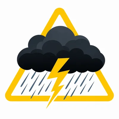
A weather app needs an icon for a severe storm warning. Describe three visual features that would make the icon easy to recognize at a small size.
- 2
Explain the difference between an icon that is decorative and an icon that is functional in a user interface.
- 3
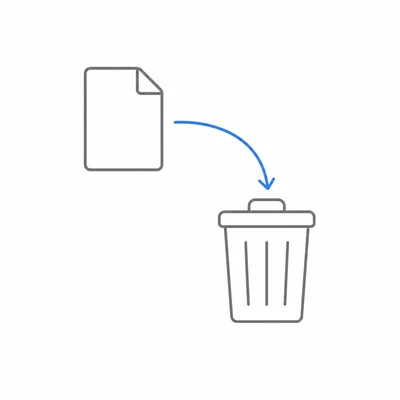
A designer uses a trash can icon to represent deleting a file. Explain why this is an example of a visual metaphor.
- 4
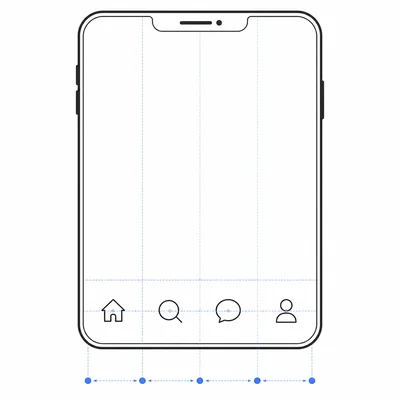
Look at a navigation bar with four items: Home, Search, Messages, and Profile. Describe one way to use spacing and alignment to make the navigation easier to use.
- 5
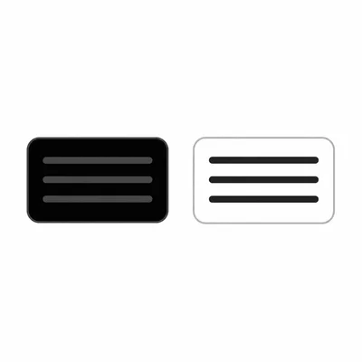
A button has dark gray text on a black background. Identify the accessibility problem and suggest an improvement.
- 6
Explain why relying only on color to show an error in a form can be inaccessible.
- 7
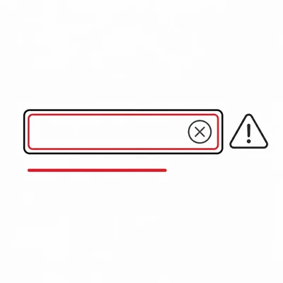
A sign-up form has a red outline around a missing email field. Add two additional design choices that would make the error message more accessible.
- 8
Describe what alt text is and explain why it matters in digital design.
- 9
Write appropriate alt text for this image: a simple icon showing a magnifying glass used as a search button.
- 10
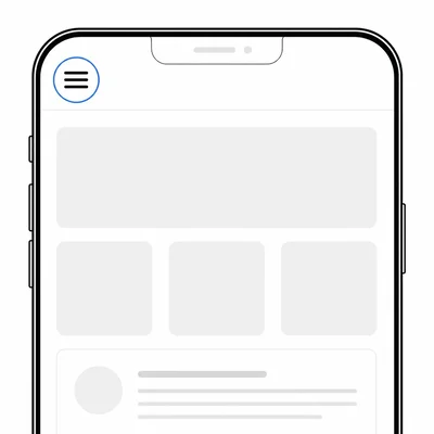
A mobile app has a menu icon, but the icon has no label. Explain one benefit and one risk of using an unlabeled icon.
- 11
Explain how hierarchy can guide a user's attention on a home screen.
- 12
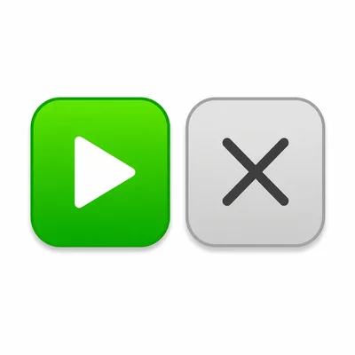
A music app has a bright green 'Play' button and a gray 'Cancel' button. Explain how this color and contrast choice supports user experience.
- 13
List three questions a designer should ask when evaluating whether an icon set is consistent.
- 14
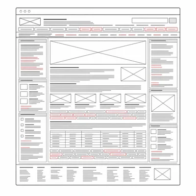
A website uses tiny text, crowded buttons, and little space between links. Explain how these choices could affect usability.
- 15
Choose one app you use often. Describe one icon or interface feature that works well and one improvement that would make it more accessible.