Confusion Matrix, ROC & Threshold Explorer
Pick a classifier quality, then drag the decision threshold across a dataset of scored predictions. The confusion matrix, precision, recall, specificity, F1, and the ROC marker all update instantly, so you can see exactly how moving the threshold trades false positives against false negatives. Useful for AP Statistics, intro data science, and machine learning courses.
Score distribution
56 examples · 28 positive · 28 negativePositives score high and negatives score low with little overlap. The threshold can separate the classes cleanly.
Examples with a score at or above the threshold are predicted positive. Lower it to catch more positives, raise it to cut false alarms.
Confusion matrix
Green cells are correct predictions. Red cells are errors. Move the threshold to trade false positives against false negatives.
Metrics at this threshold
ROC curve
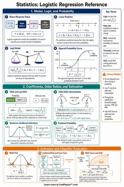
AUC 0.978The dashed diagonal is a random classifier (AUC 0.5). The orange dot marks the current threshold. A curve that hugs the top-left corner has the highest AUC.
Reading the tradeoff
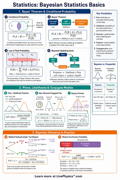
Lowering the threshold predicts positive more often. That raises recall (you catch more true positives) but usually lowers precision (more false positives slip in). Raising the threshold does the reverse. There is rarely a single threshold that maximizes both at once, so the right choice depends on the cost of each error type.
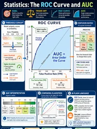
The ROC curve traces every possible threshold as a point of false positive rate versus true positive rate. The area under it (AUC) is a single number from 0.5 (no better than chance) to 1.0 (perfect ranking) that summarizes the classifier across all thresholds, before you commit to any one of them.
Reference Guide
The confusion matrix
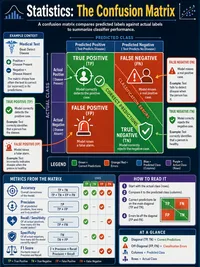
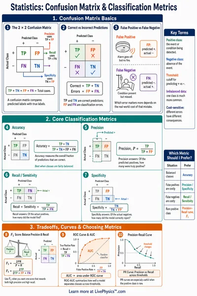
A binary classifier sorts every example into one of four buckets, defined by the true label and the predicted label.
- True positive (TP). Actually positive, predicted positive.
- False positive (FP). Actually negative, predicted positive. A false alarm.
- False negative (FN). Actually positive, predicted negative. A miss.
- True negative (TN). Actually negative, predicted negative.
Every metric in this tool is built from these four counts. The threshold decides which side of the line each example lands on.
Precision vs recall
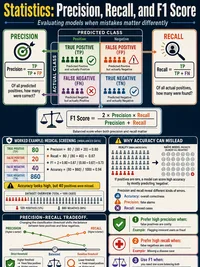
Precision is TP / (TP + FP), the share of positive predictions that are correct. Recall is TP / (TP + FN), the share of real positives the model catches.
Lowering the threshold raises recall but tends to lower precision, because more examples get flagged positive. Raising it does the reverse. The F1 score is the harmonic mean of the two, which rewards a balance rather than one extreme.
On the imbalanced preset, precision drops fast even with good recall, because a small number of true positives is swamped by false positives from the large negative class.
The ROC curve and AUC
The ROC curve plots true positive rate against false positive rate at every threshold. Each point is one possible decision line. A curve that bends toward the top-left corner separates the classes well.
The area under the curve (AUC) collapses the whole curve into one number from 0.5 to 1.0. AUC 0.5 is the dashed diagonal of a coin flip. AUC near 1.0 means almost every positive scores above almost every negative.
Because AUC averages over all thresholds, it compares classifiers before you pick a threshold, which makes it handy for model selection.
Choosing a threshold for a real application
AUC measures ranking quality, but a deployed system still needs one threshold. The right value depends on which error costs more.
- Disease screening. A missed case (FN) is costly, so favor recall with a lower threshold.
- Spam filtering. A blocked real email (FP) annoys users, so favor precision with a higher threshold.
- Fraud alerts. Analysts have limited time, so tune the threshold to the review capacity.
Move the slider and watch the confusion matrix to find the operating point that fits the costs of your problem.