Practice the basics of user interface design, including layout, navigation, buttons, feedback, accessibility, and usability.
Read each problem carefully. Answer in complete sentences. Show your design thinking in the space provided.
Planning clear, useful, and accessible app screens
CS - Grade 6-8
- 1
Define user interface in your own words. Then name two examples of user interface elements in a mobile app.
- 2
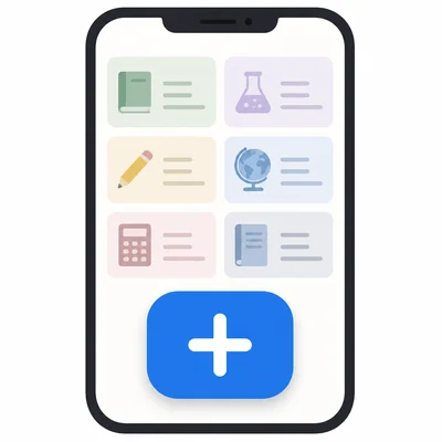
A homework planner app has a large button labeled Add Assignment on the home screen. Explain why this is a good user interface choice.
- 3
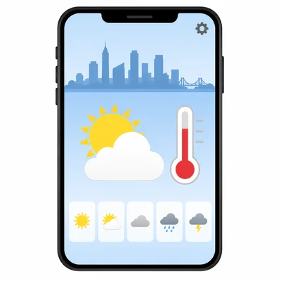
Look at this screen description: A weather app home screen shows the city name, current temperature, weather icon, hourly forecast, and a Settings button. List the three pieces of information that should probably be easiest to see first.
- 4
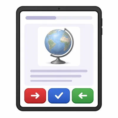
A student designs a quiz app with a red Next button, a blue Submit button, and a green Back button. Explain one problem this could cause and suggest a better design choice.
- 5
Write a clear button label for each action: saving a drawing, deleting a photo, and starting a game.
- 6
A music app uses only a trash can icon for deleting a playlist. Explain why adding text might help some users.
- 7
Describe a simple navigation menu for a school lunch app. Include at least four sections the app should have.
- 8
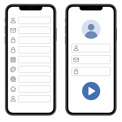
A sign-up screen asks for name, email, password, favorite color, favorite movie, and home address before a user can play a simple puzzle game. Explain how the form could be improved.
- 9
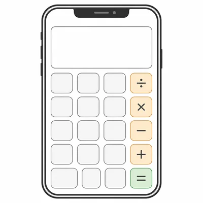
Sketch or describe a wireframe for a simple calculator app. Include the display area and number buttons.
- 10
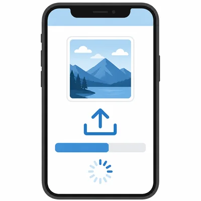
An app takes 5 seconds to upload a photo after the user taps Upload, but nothing changes on the screen. Explain what feedback the app should show.
- 11
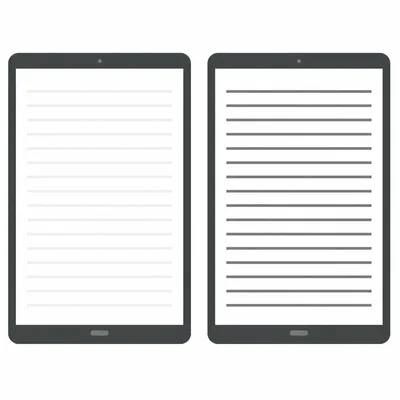
A reading app uses light gray text on a white background. Explain why this may be a problem and how to fix it.
- 12
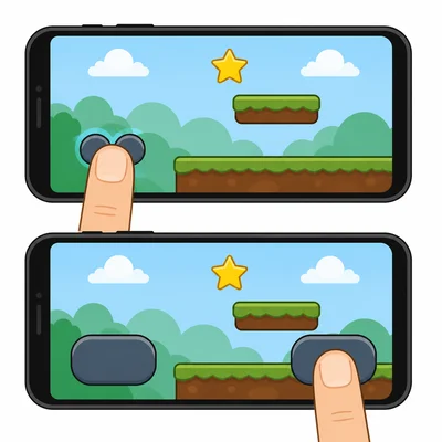
A button in a game app is very small and placed close to another button. Explain how this could affect users and suggest a better layout.
- 13
Write a helpful error message for a password field when the user enters only three characters. The password must be at least eight characters.
- 14
Put these user flow steps in a logical order for ordering a library book in an app: Confirm request, Search for a book, Open book details, Tap Request Book, See request success message.
- 15
You are testing a new reminder app with classmates. Write two questions you could ask them after they try the app to learn whether the interface is easy to use.