Sign in to save

Bookmark this page so you can find it later.

Sign in to save

Bookmark this page so you can find it later.

Math middle-school May 21, 2026

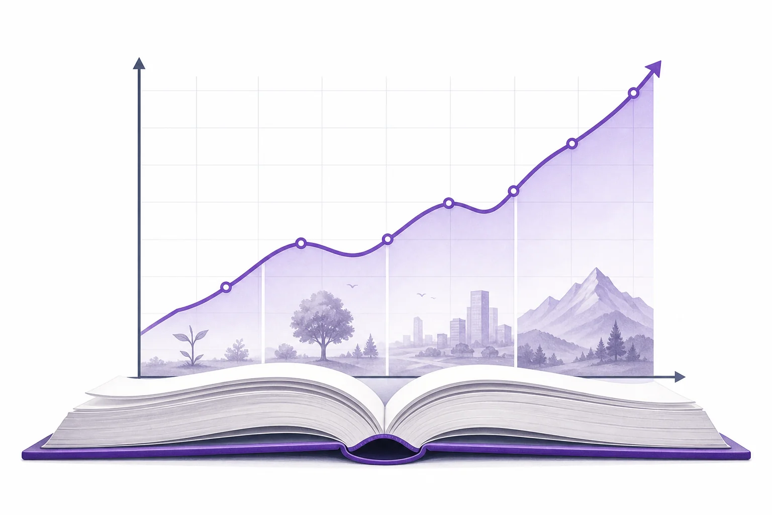
Why Do Graphs Tell Stories?

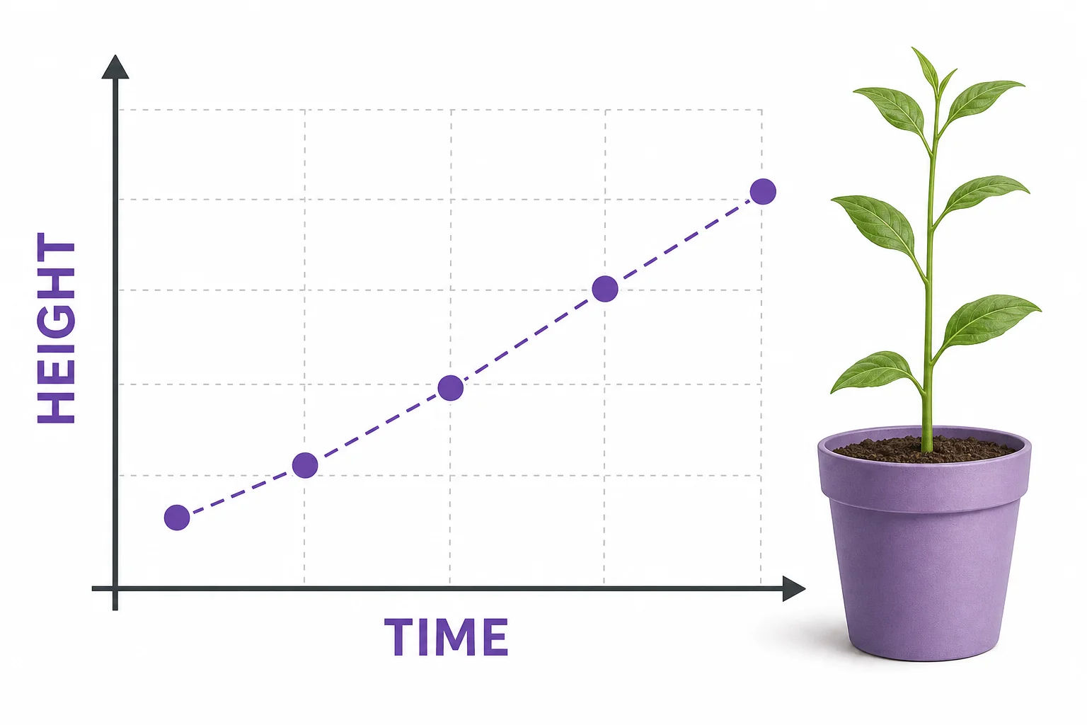
How data shows change over time

Middle school students reading a line graph that connects data points to a simple real world story

Graphs tell stories because they show how one quantity changes as another quantity changes. The axes set the setting, the points show events, and the slope shows how fast change is happening. Reading a graph is like reading a short data story from left to right.

Big Idea. Common Core 6.SP.B asks students to summarize and describe data, and graphs help turn data into a clear description of change.

A graph is not just a picture of numbers. It is a way to show what happened. The bottom axis often moves the story forward, such as time, distance, or the number of tries. The side axis shows what is being measured, such as height, speed, cost, or temperature. Each point is one moment in the story. A line or pattern connects those moments so your brain can see change. Middle school math uses graphs to help students describe data, compare rates, and notice patterns. That work connects to Common Core 6.SP, which focuses on understanding distributions and summarizing data. A graph can show a plant growing, a bus trip, a savings plan, or a basketball score. You can also practice making your own graphs with the LivePhysics graphing calculator when you want to test how a rule becomes a picture.

Axes set the scene

A coordinate plane with a horizontal time axis, a vertical height axis, and a few plotted points showing plant growth
Axes tell what is being compared
Every story needs a setting. In a graph, the axes create that setting. The horizontal axis usually shows the input, such as time, days, or distance walked. The vertical axis usually shows the output, such as temperature, money saved, or height. The labels and units tell you what the graph is about. Without them, a line could mean almost anything. A point at 3 and 12 could mean 3 hours and 12 miles, or 3 weeks and 12 centimeters. Good graph readers start by checking the title, axis labels, and units before they look at the pattern. This is like reading the first page of a story before jumping to the ending. Once the axes make sense, each point becomes easier to interpret. The graph begins to show who or what changed, and how the change was measured.

Before reading the line, read the axes.

Points are events

A graph point connected by guide lines to its horizontal and vertical values
One point gives two values
A single point on a graph is like one event in a data story. It tells you two facts at the same time. For example, one point might mean that after 4 minutes, a runner has traveled 600 meters. Another point might mean that on day 7, a seedling is 5 centimeters tall. The point does not explain everything by itself. It needs the axes to give it meaning. When you read a point, move down to the horizontal axis and across to the vertical axis. Those two values work together. A table can show the same values, but a graph makes the pattern easier to see. If the points climb, the output is increasing. If they fall, the output is decreasing. If they stay flat, the output is not changing. Each point is a small piece of evidence in the larger story.

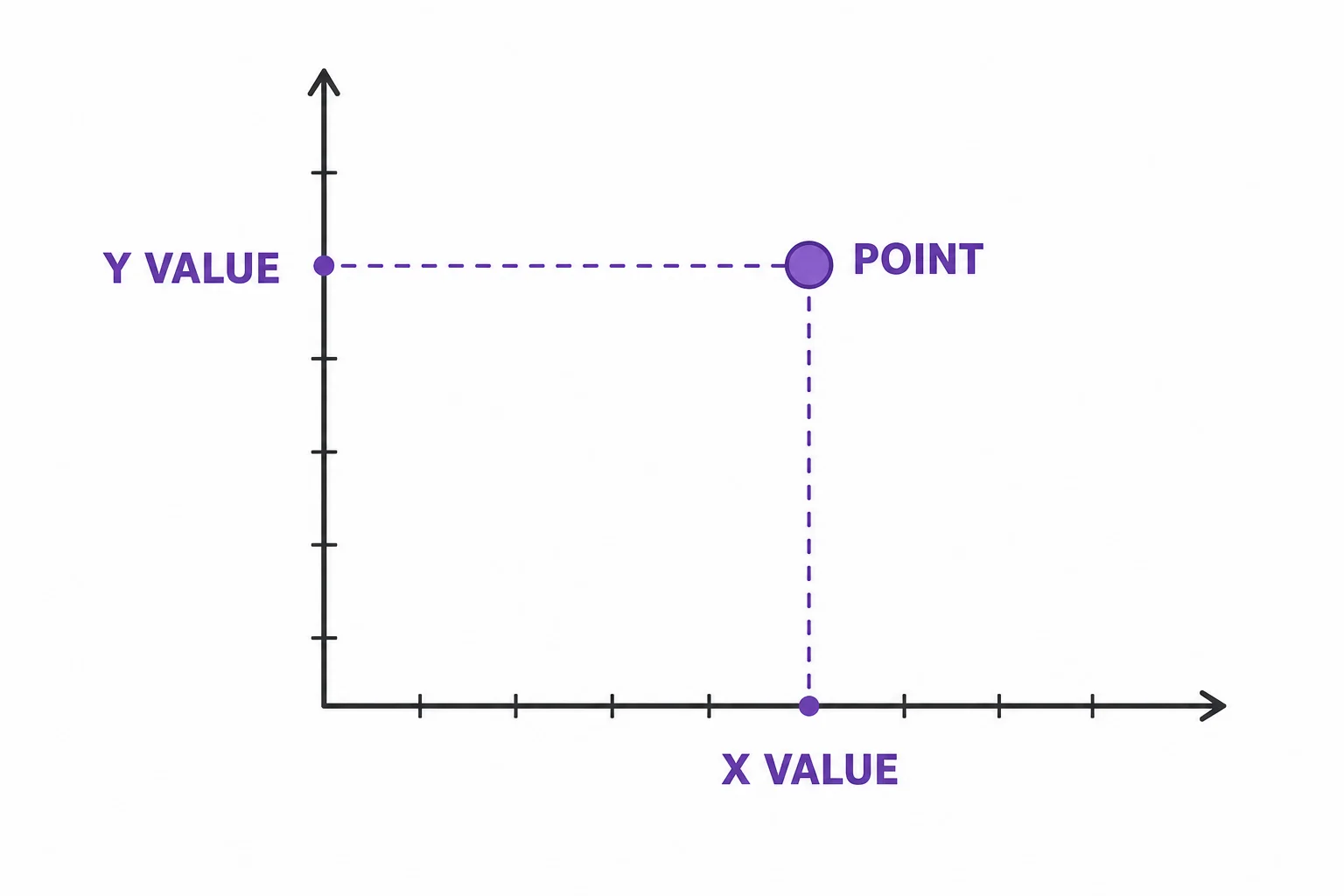
A point is one measured moment.

Slope shows pace

Three line segments on small graphs showing steep increase, gentle increase, and no change
Slope describes rate of change
Some stories move slowly. Some change quickly. On a graph, slope shows the pace of change. A steep upward line means the output is increasing quickly. A gentle upward line means it is increasing slowly. A flat line means there is no change during that part of the graph. A downward line means the output is decreasing. In middle school, slope is often described as rate of change. That means how much the vertical value changes for each step along the horizontal axis. For example, a savings graph that rises by 5 dollars each week has a rate of 5 dollars per week. A distance graph that rises faster shows a faster trip. Slope helps you compare two stories even when the numbers are different. It turns the shape of a line into a statement about speed, growth, cost, or another kind of change.

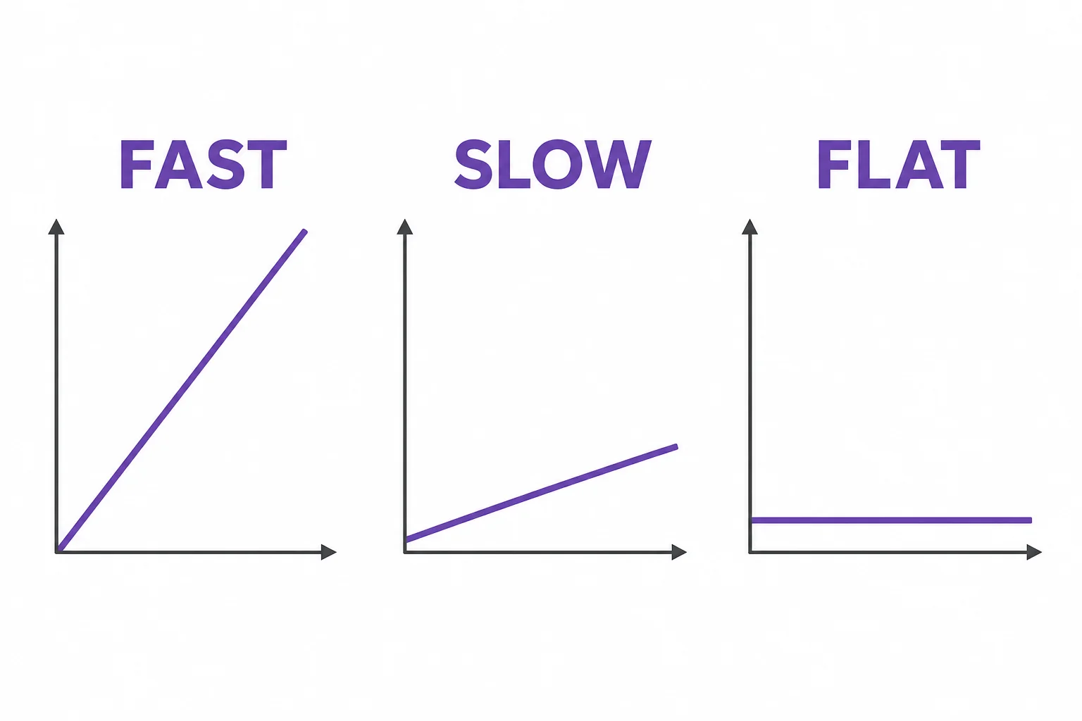
Slope tells how fast the story changes.

Shape shows chapters

A distance versus time graph with a rising section, a flat resting section, and another rising section
Different sections can mean different events
Many graphs do not tell one simple story from start to finish. They have sections, like chapters. A distance graph might rise while a person walks, stay flat while the person rests, and rise again when the person starts moving. A temperature graph might climb during the day and fall after sunset. When you read a graph, look for changes in shape. A straight section suggests a steady rate. A curve suggests the rate itself is changing. A sudden jump may show a quick event or a measurement error. A flat section often means nothing changed in the measured value. These sections help you retell the graph in words. You can say when the action sped up, slowed down, stopped, or reversed. This is where graph reading becomes narrative reading. The graph gives evidence, and your job is to describe it accurately.

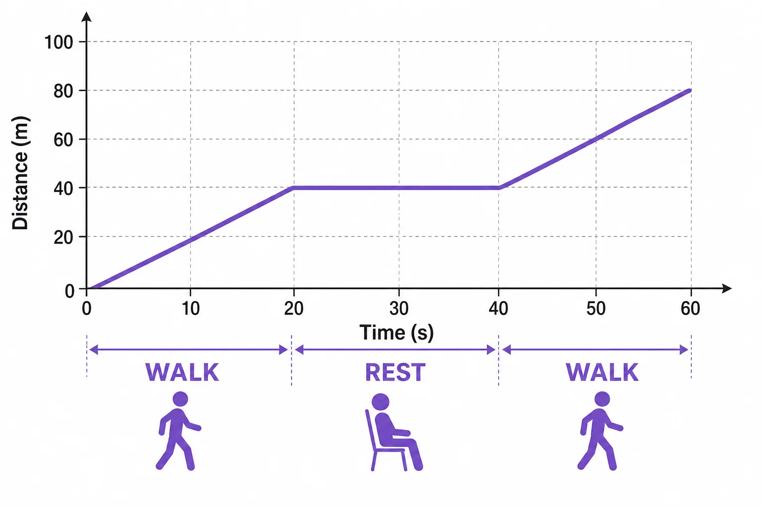
A graph can have chapters.

Data stories need care

Two graphs with the same data but different vertical scales showing how scale changes the visual impression
Scale can change how a pattern looks
Graphs can make patterns easier to see, but they can also mislead if you read too quickly. The scale matters. A graph that starts the vertical axis at 90 instead of 0 can make a small change look large. Units matter too. One graph might use minutes while another uses hours. The sample size matters because a few data points may not show a reliable pattern. Outliers can also affect the story. An outlier is a value that is far from the others. It may be important, or it may be a mistake. A careful reader asks what was measured, how it was measured, and whether the graph supports the conclusion. This connects math to real decisions. News reports, sports stats, weather charts, and school surveys all use graphs. Reading them well helps you separate evidence from guesswork.

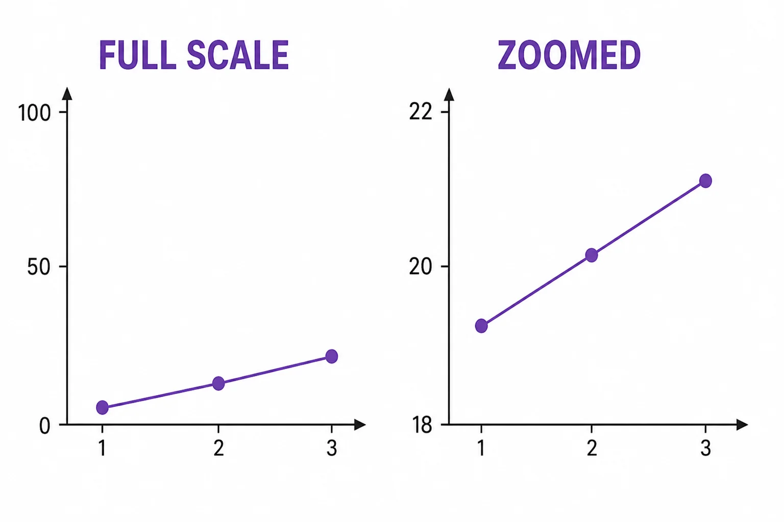
A good graph reader checks the scale.

Vocabulary

Axis
A reference line on a graph that shows what is being measured and in what units.
Point
A location on a graph that matches one pair of values.
Slope
A measure of how steep a line is, often used to describe rate of change.
Rate of change
How much one quantity changes compared with another quantity.
Scale
The spacing and number pattern used on an axis.
Outlier
A data value that is far away from most of the other values.

In the Classroom

Graph a walk

25 minutes | Grades 6-8

Students walk across the room while a partner records position every 5 seconds. They graph the data and write a short paragraph that describes when the walker moved quickly, slowly, or stopped.

Match the story

20 minutes | Grades 6-8

Give groups several short stories and several unlabeled graphs. Students match each story to a graph and defend their choice using axis labels, slope, and shape.

Scale detective

15 minutes | Grades 6-8

Students compare two graphs made from the same data but with different vertical scales. They explain how the scale changes the visual message and write one rule for fair graph reading.

Key Takeaways

  • Graphs tell data stories by showing how one quantity changes with another.
  • Axes give the setting by naming the variables and units.
  • Points show measured events or values.
  • Slope shows the rate or pace of change.
  • Careful readers check scale, units, outliers, and the source of the data.