Practice identifying and applying contrast, alignment, and hierarchy in graphic design layouts.
Read each problem carefully. Use design vocabulary in your answers. Show sketches or notes in the space provided when helpful.
Using visual choices to guide attention and improve communication
Art & Design - Grade 6-8
- 1

Define contrast in graphic design. Then name two ways a designer can create contrast on a poster.
- 2
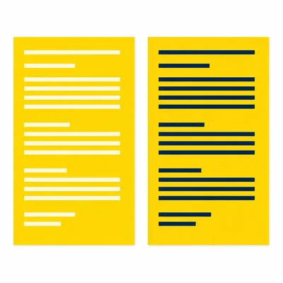
A flyer has a bright yellow background with white text. Many people have trouble reading it. Explain the design problem and suggest a better choice.
- 3
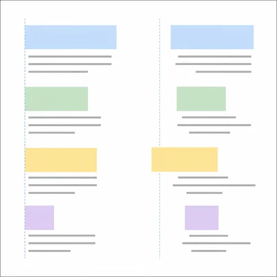
Define alignment in graphic design. Explain why alignment helps a layout look organized.
- 4
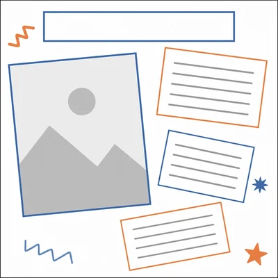
Look at a poster layout with a title centered, a photo shifted far left, and three text boxes placed at random angles. Identify one alignment problem and explain how to fix it.
- 5

Define visual hierarchy. Explain how hierarchy helps a viewer understand a design quickly.
- 6
A concert poster includes the band name, date, location, ticket price, and a website. List these five items in a likely hierarchy from most important to least important.
- 7
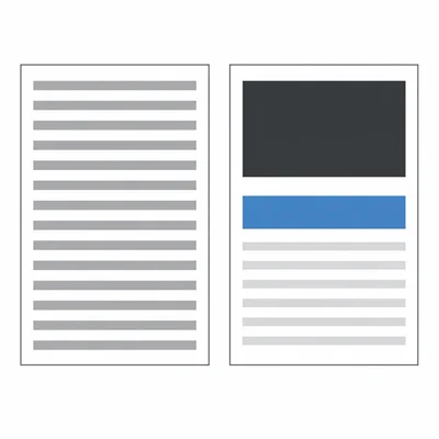
A school club poster uses the same font size, same color, and same weight for every word. Explain how this affects hierarchy and give two improvements.
- 8
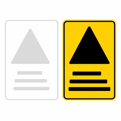
Choose the best design choice for a warning sign: small gray text on a white background, or large black text on a yellow background. Explain your answer using contrast and hierarchy.
- 9

A designer wants a headline to be the first thing viewers notice. Name three visual changes that could make the headline stronger in the hierarchy.
- 10
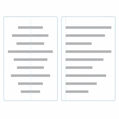
Explain the difference between centered alignment and left alignment. Give one situation where each might work well.
- 11
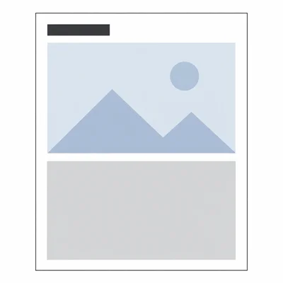
A magazine page has a headline at the top, a large photo below it, and a caption under the photo. The caption is larger than the headline. Explain the hierarchy problem.
- 12
Create a plan for a poster about a school art show. Describe how you would use contrast, alignment, and hierarchy.
- 13

In a layout, all text is aligned to the left edge, but one small paragraph starts farther to the right for no clear reason. Explain why this might be distracting.
- 14

A designer uses a red button on a mostly blue website page. Explain how contrast can guide the viewer's action.
- 15

Review this design description: A charity event flyer has a large title, a clear photo, left-aligned details, and a small logo at the bottom. Identify one example of contrast, one example of alignment, and one example of hierarchy.