Practice reading scientific figures and captions by identifying variables, interpreting trends, evaluating evidence, and connecting visuals to scientific claims.
Read each figure description, caption, or data display carefully. Use labels, units, keys, captions, and trends to support your answers.
Interpreting data displays, labels, captions, and visual evidence
Science - Grade 9-12
- 1
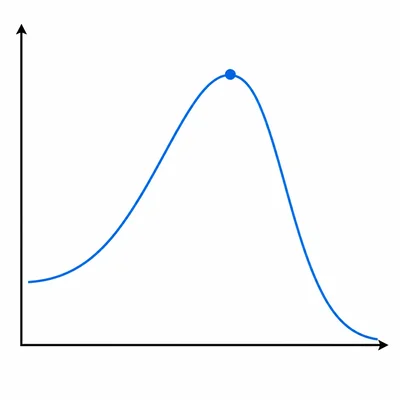
A graph is titled "Effect of Temperature on Enzyme Activity." The x-axis is labeled "Temperature (°C)" and the y-axis is labeled "Reaction rate (mmol/min)." The line rises from 10°C to 37°C, reaches its highest point at 37°C, and then drops sharply by 60°C. Identify the independent variable, dependent variable, and the main trend shown.
- 2
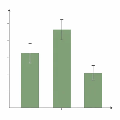
A caption reads: "Figure 2. Average plant height after 21 days of growth under three light conditions. Error bars show ±1 standard deviation." What information does the caption add beyond the title of the figure?
- 3
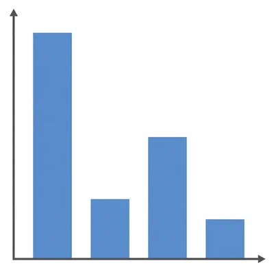
A bar graph compares the number of bacterial colonies after treatment with four antibiotics. Antibiotic A has 120 colonies, B has 35 colonies, C has 80 colonies, and D has 10 colonies. The caption says lower colony count indicates greater antibiotic effectiveness. Which antibiotic appears most effective, and what evidence supports your answer?
- 4
A figure legend includes the note: "n = 25 students per group." Explain what this tells the reader and why it matters when interpreting the figure.
- 5
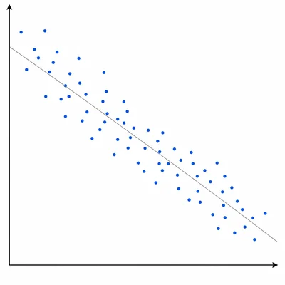
A scatter plot shows dissolved oxygen in a lake on the y-axis and water temperature on the x-axis. The points form a downward trend from left to right. What relationship does the figure suggest between temperature and dissolved oxygen?
- 6
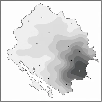
A map uses darker shading to represent higher nitrate concentration in groundwater. The caption states: "Samples were collected from wells in April 2024." What should a reader avoid concluding from this figure alone?
- 7
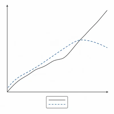
A figure shows two lines: a solid line for Group 1 and a dashed line for Group 2. The key identifies the line types. Why is the key important for interpreting the figure?
- 8
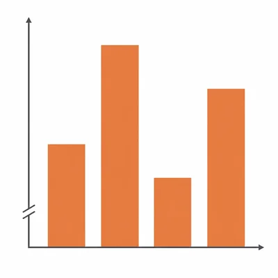
A graph's y-axis is labeled "Mass (g)" and runs from 48 to 52 instead of 0 to 52. The bars appear very different in height even though the values are close together. What should a careful reader notice?
- 9
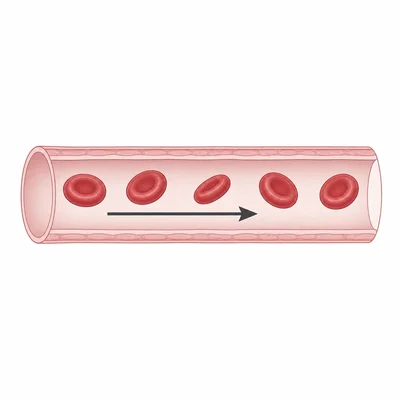
A caption reads: "The arrow indicates the direction of blood flow through the vessel." In the figure, the arrow points from left to right. How does the arrow help the reader understand the image?
- 10
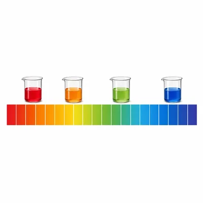
A data table lists pH values for four solutions: lemon juice 2.2, vinegar 3.0, pure water 7.0, and baking soda solution 8.3. The caption says lower pH means more acidic. Rank the solutions from most acidic to least acidic.
- 11
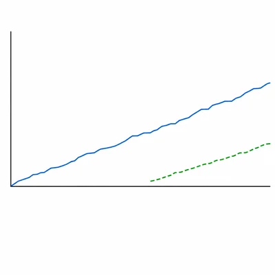
A figure compares CO2 concentration over time at two sites. Site A has data from 2000 to 2020, while Site B has data only from 2015 to 2020. What limitation should be mentioned when comparing the two sites?
- 12
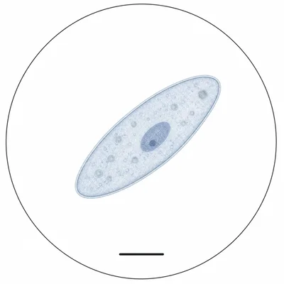
A microscope image caption says: "Scale bar = 10 µm." A cell in the image is about three scale bars long. Estimate the cell's length and explain your reasoning.
- 13
A figure caption states: "Values are means from three trials." Why might repeated trials be useful in a scientific investigation?
- 14
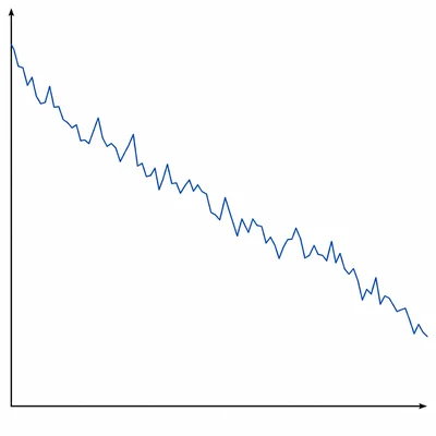
A graph shows ice extent in the Arctic from 1980 to 2020. The line has year-to-year ups and downs but an overall downward trend. Write one accurate claim based on the figure.
- 15
A student writes, "The graph proves that fertilizer caused the plants to grow taller." The figure shows taller average plants in the fertilizer group than in the no-fertilizer group, but the caption does not describe random assignment or controlled conditions. Revise the student's statement to be more scientifically cautious.