Sign in to save

Bookmark this page so you can find it later.

Sign in to save

Bookmark this page so you can find it later.

Math middle-school May 21, 2026

Why Can Averages Be Misleading?

How one number can hide the shape of data

A classroom data display showing two dot plots with the same mean but different spreads and one outlier pulling an average upward.

Averages can be misleading when one very high or very low value pulls the mean away from most of the data. The median can give a better middle value when a data set has outliers or is lopsided. Good data readers look at the mean, median, spread, and the graph before making a claim.

Big Idea. Common Core 6.SP.B.5 asks students to summarize numerical data using center, spread, and the overall shape of a distribution.

An average sounds fair because it turns many numbers into one number. That can help when you compare test scores, heights, game points, rainfall, or prices. But one number can also hide a lot. Imagine five students earn 8, 9, 9, 10, and 14 points on a quiz. The mean is $\frac{8+9+9+10+14}{5}=10$. Most students did not score 10. One high score pulled the mean upward. The median is 9, which better describes the middle of this small group. This is why data literacy matters. A mean is not wrong just because it can mislead. It answers one kind of question. A median answers a different kind. A graph can show what both numbers leave out. In middle-school statistics, the goal is not to memorize one best average. The goal is to choose a summary that matches the data and the question.

Mean and median

A number line with dots at 2, 3, 3, 4, and 8, showing the median at 3 and the mean at 4.
The mean and median can point to different centers.
The mean is the total divided by the number of values. The median is the middle value after the numbers are put in order. For the data set 2, 3, 3, 4, 8, the mean is 4 because the total is 20 and there are 5 values. The median is 3 because 3 is in the middle. Both numbers are correct, but they tell different stories. The mean uses every value, so it changes when any value changes. The median cares about order, so it is harder for one extreme value to move it. In many balanced data sets, the mean and median are close. In lopsided data sets, they can be far apart. That gap is a signal. It tells you to look at the whole distribution before making a conclusion.

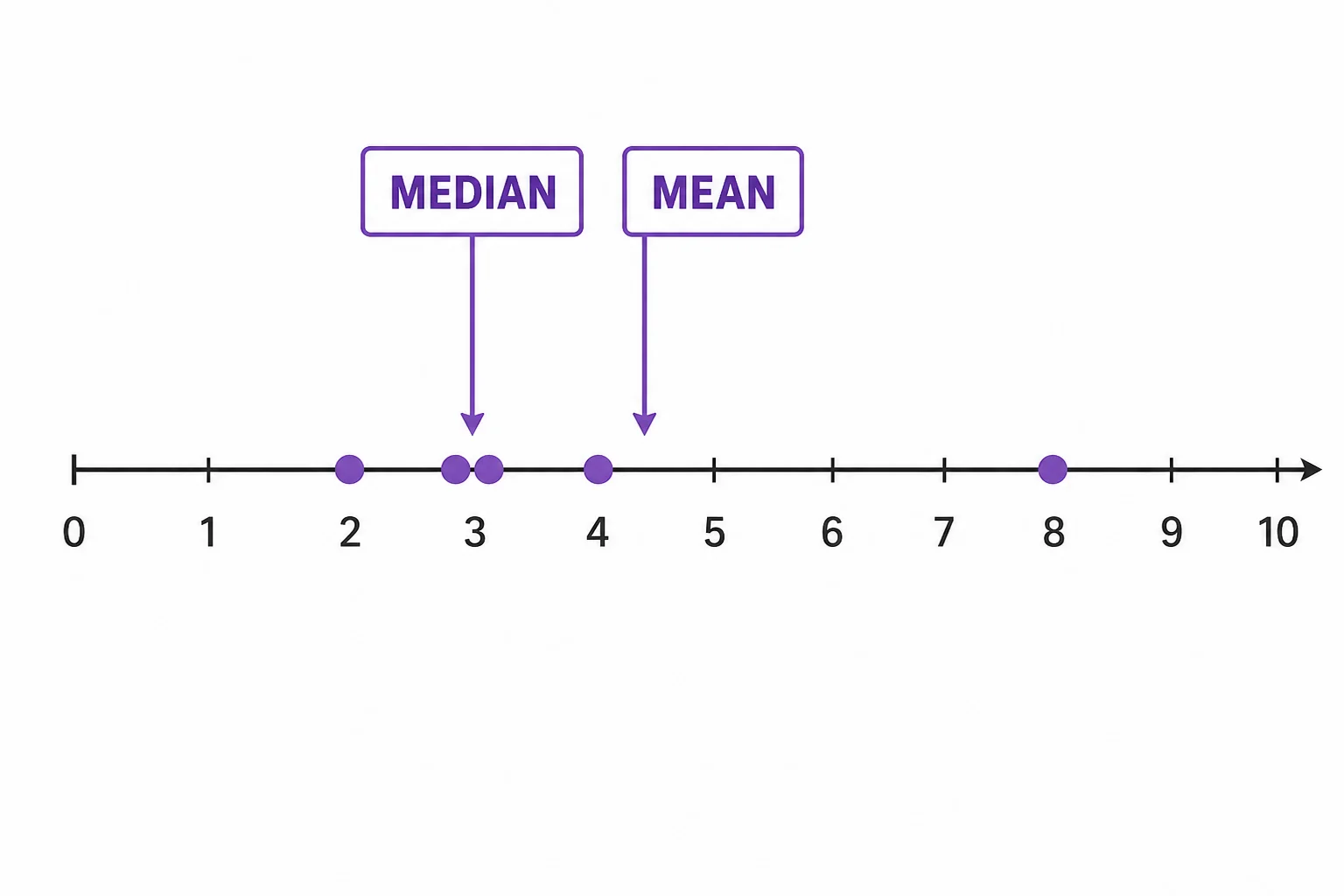
The mean balances the data, while the median marks the middle.

Outliers pull the mean

A dot plot of dollar amounts where most dots are near 4 to 6 and one dot is far away at 40, pulling the mean to the right.
One outlier can move the mean away from most values.
An outlier is a value that is far from the rest of the data. It may be real, like one very tall plant in a garden. It may also be a mistake, like recording 250 inches instead of 25 inches. Either way, an outlier can strongly affect the mean. Suppose six people have 4, 5, 5, 6, 6, and 40 dollars. The mean is 11 dollars, but five of the six people have 6 dollars or less. If you said the typical person has 11 dollars, the statement would feel wrong. The median is 5.5 dollars, which is closer to most people in the group. This does not mean the mean is useless. The mean is useful when the total matters. The median is useful when you want a typical value that resists extremes.

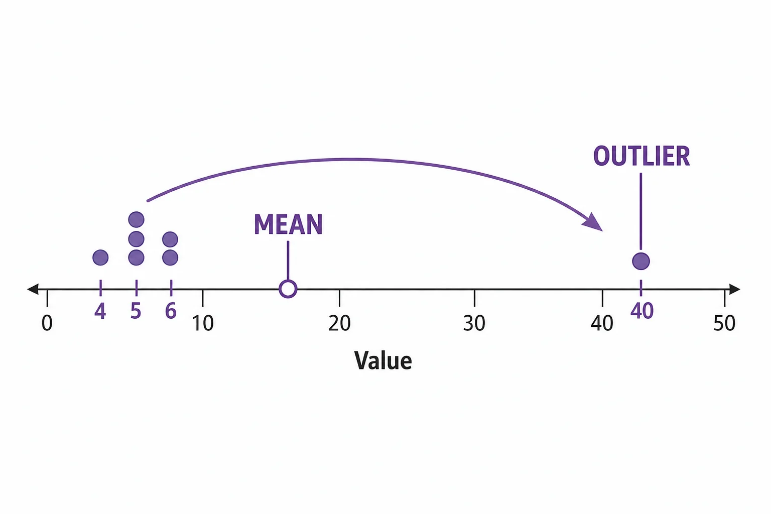
Outliers can make the mean describe the extreme more than the group.

Skewed data

A right-skewed distribution with many bars on the low side and a long tail to the high side, with the mean to the right of the median.
A long tail pulls the mean toward it.
A data set is skewed when it has a long tail on one side. Many real data sets are skewed. House prices often have many moderate values and a few very high values. Waiting times can have many short waits and a few long delays. In a right-skewed data set, the long tail points to higher numbers. The mean is usually pulled toward that tail. The median stays closer to the crowded part of the graph. This is why reports about income often mention the median. A few very high incomes can raise the mean even when most people earn less. Skew does not make data bad. It just means the shape matters. Before trusting an average, check whether the data are balanced or lopsided.

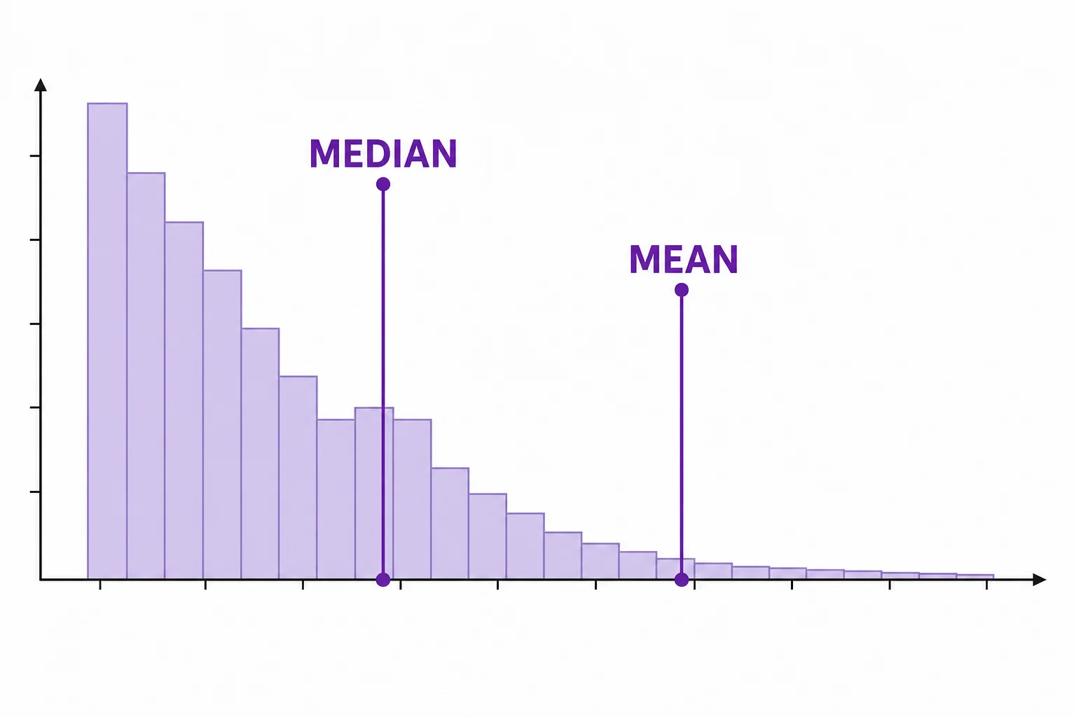
Skewed data need a graph, not just a single average.

Same mean, different stories

Two dot plots with the same mean of 80, one tightly clustered and one widely spread out.
The same mean can hide very different spreads.
Two data sets can have the same mean and still look very different. One class might have scores of 70, 75, 80, 85, and 90. Another class might have scores of 40, 70, 80, 90, and 120. Both have a mean of 80. The first class is tightly grouped around 80. The second class is spread out. If a report only says both classes averaged 80, it hides an important difference. Spread tells how much the data vary. Common measures of spread include range and interquartile range. A dot plot also makes spread easy to see. When you compare groups, ask whether the values are close together or far apart. Averages summarize center, but they do not summarize everything.

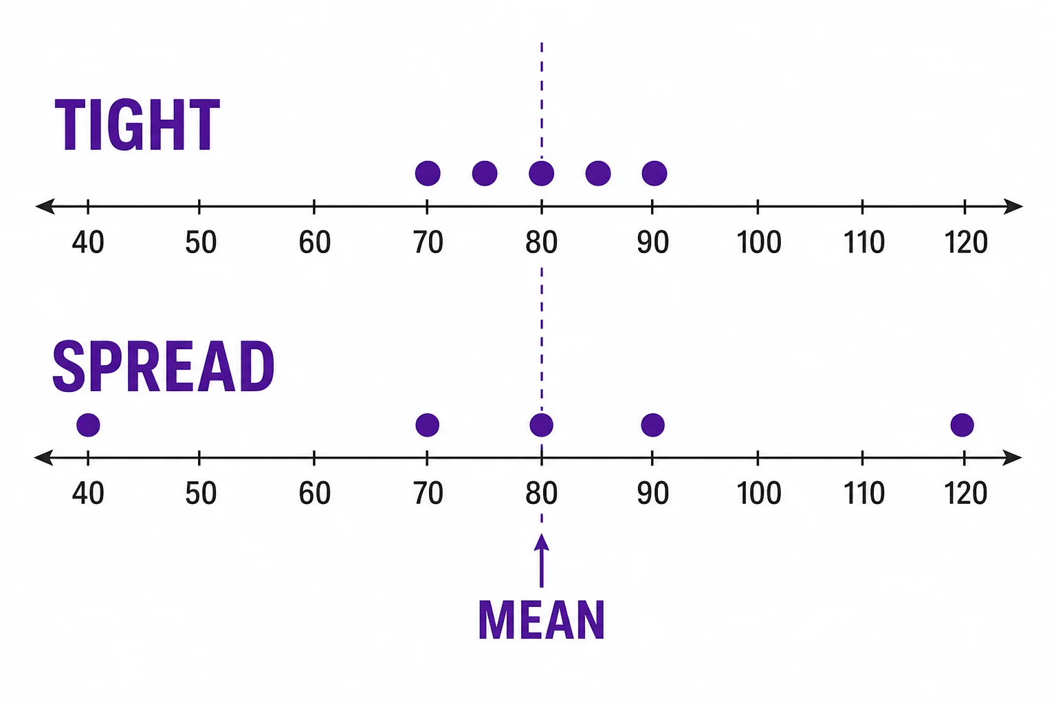
Center and spread work together.

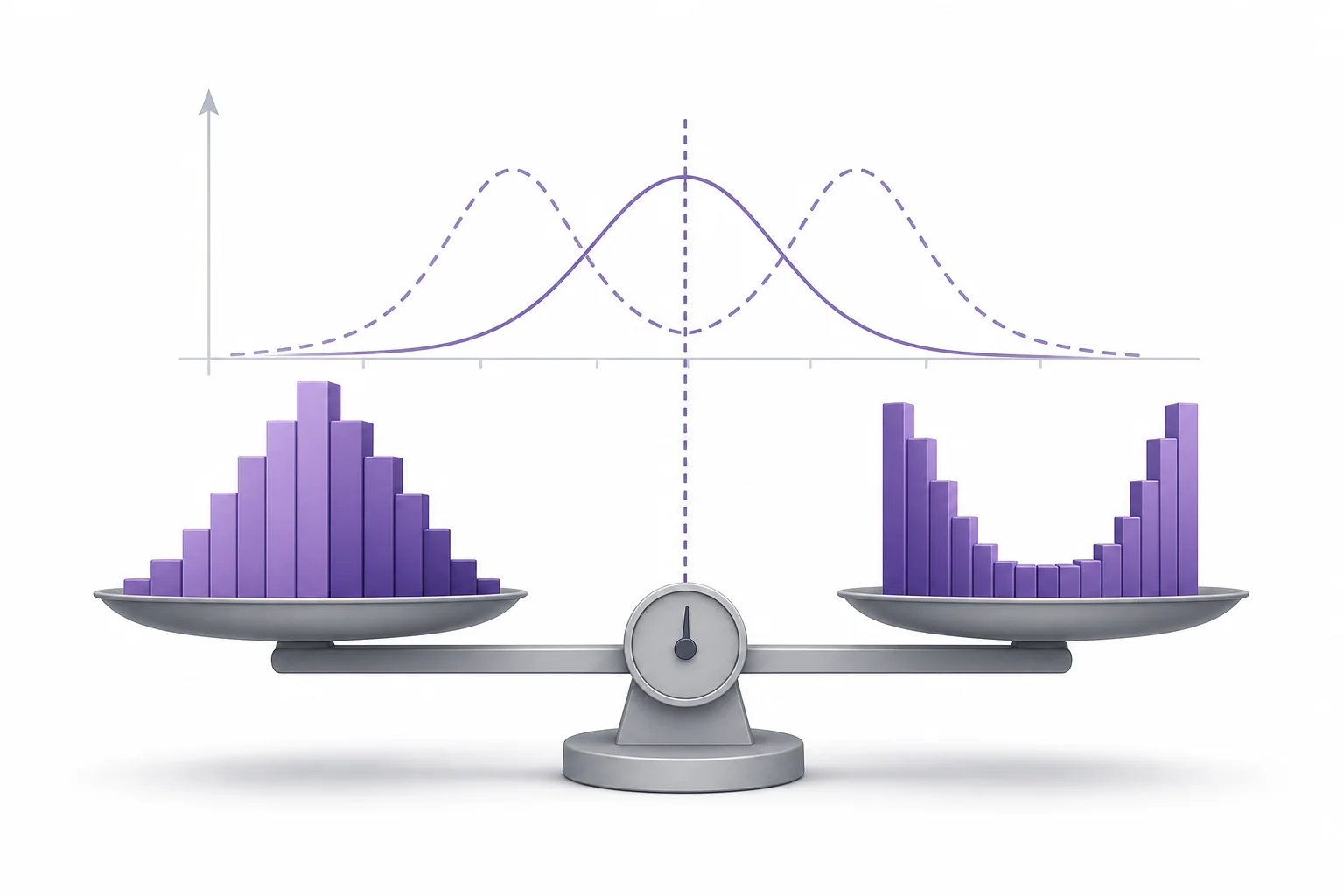
Choose the right summary

A student comparing a table, a dot plot, and summary cards for mean, median, outlier, and spread before choosing a data claim.
Data claims are stronger when they include shape and spread.
A good data summary starts with the question. If you want the fair share after combining everything, the mean is often useful. For example, mean rainfall can help estimate total water over time. If you want the middle experience in a lopsided group, the median may be better. For example, median home price can describe what a typical buyer faces better than mean home price. If you want to understand risk or consistency, spread matters. A team with steady scores is different from a team with wild scores, even if the mean is the same. The strongest data claims use more than one clue. They name the measure of center, show the graph, and explain any outliers. That habit helps you avoid being fooled by a simple average.

Pick the summary that matches the data and the question.

Vocabulary

Mean
The sum of all values divided by the number of values.
Median
The middle value when the data are listed in order.
Outlier
A value that is far away from most other values in a data set.
Skewed distribution
A data shape with a long tail on one side.
Spread
How far apart the values in a data set are.

In the Classroom

Build two averages

20 minutes | Grades 6-8

Students make two small data sets with the same mean but different spreads. They draw dot plots and explain why the same mean does not tell the same story.

Outlier investigation

25 minutes | Grades 6-8

Give each group a data set, then add one extreme value. Students recalculate the mean and median and compare which measure changed more.

Choose the better summary

30 minutes | Grades 6-8

Students read short real-world scenarios about prices, scores, rainfall, and wait times. For each one, they choose mean or median and justify their choice using shape, outliers, or spread.

Key Takeaways

  • The mean uses every value, so outliers can move it a lot.
  • The median is often better for describing the middle of skewed data.
  • A graph can show patterns that a single average hides.
  • Two data sets can share a mean but have different spreads.
  • Strong data claims explain center, spread, shape, and outliers.
Content generated with AI assistance and reviewed by the LivePhysics editorial team. See sources below for original references.