Why Do Graphs Sometimes Lie?
How design choices can change a data story
Graphs can mislead when their scales, axes, or selected data ranges change how the pattern looks. The numbers may be real, but the picture can make a small change look huge or hide a large change. Careful readers check the axes, units, time range, and missing data before trusting the graph.
Graphs turn numbers into pictures. That makes them powerful, but it also makes them easy to misuse. A bar chart can make one value look twice as large just by cutting off the bottom of the scale. A line graph can make a slow change look steep by showing only a short time window. A scatter plot can seem to show a strong pattern if the points that disagree are left out. None of these tricks require fake numbers. The lie often comes from the frame around the data. This matters in news, sports, health, school reports, and social media posts. Data literacy means asking how a graph was built, not just reading the tallest bar or the steepest line. In math class, this connects to ratios, percent change, scatter plots, and claims based on evidence.
The axis can change the drama
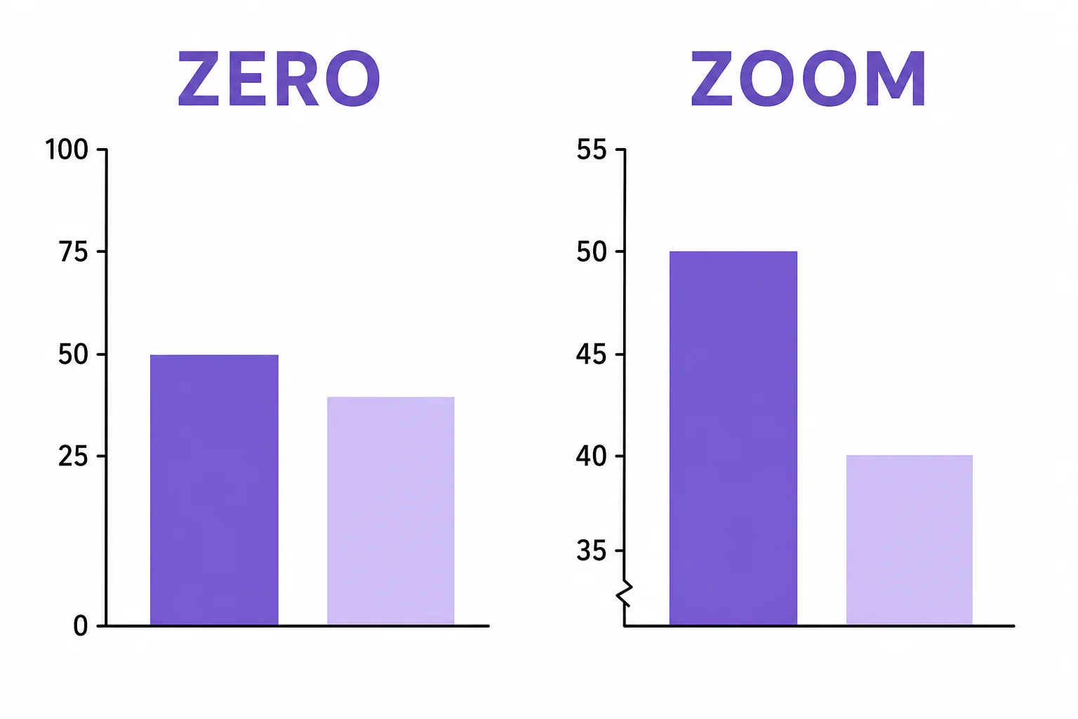
A cut-off axis can turn a small difference into a big-looking one.
Scale spacing matters
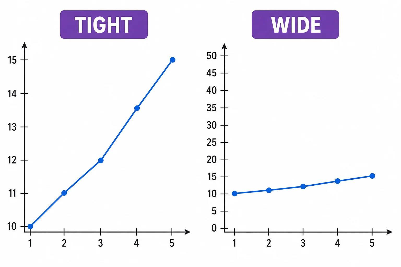
The slope you notice depends on the scale you are shown.
Time windows can hide the pattern
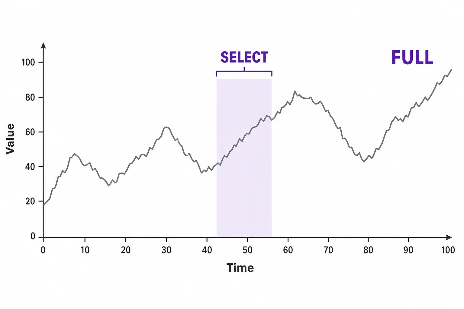
A short range can make a mixed pattern look simple.
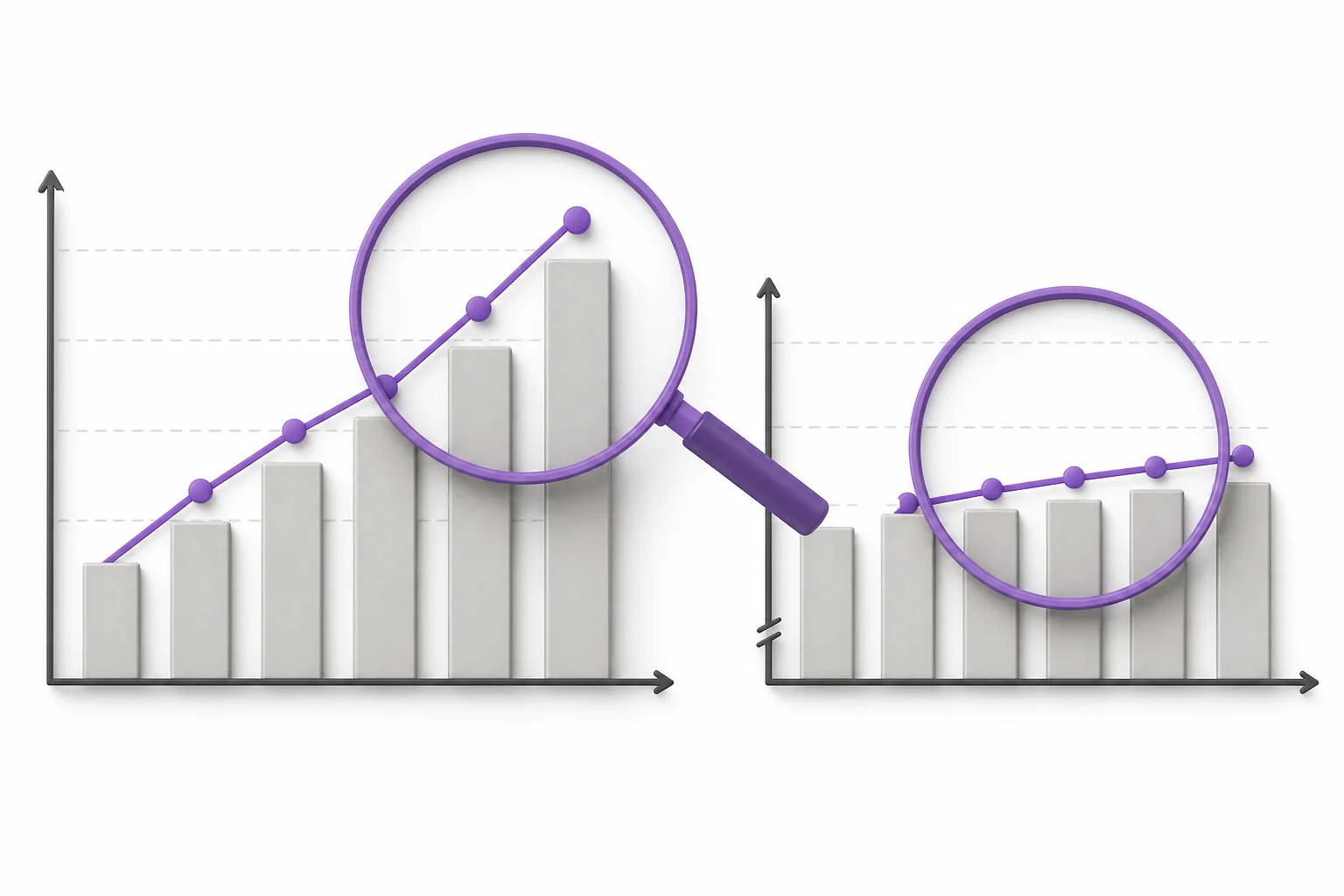
Missing points change the message
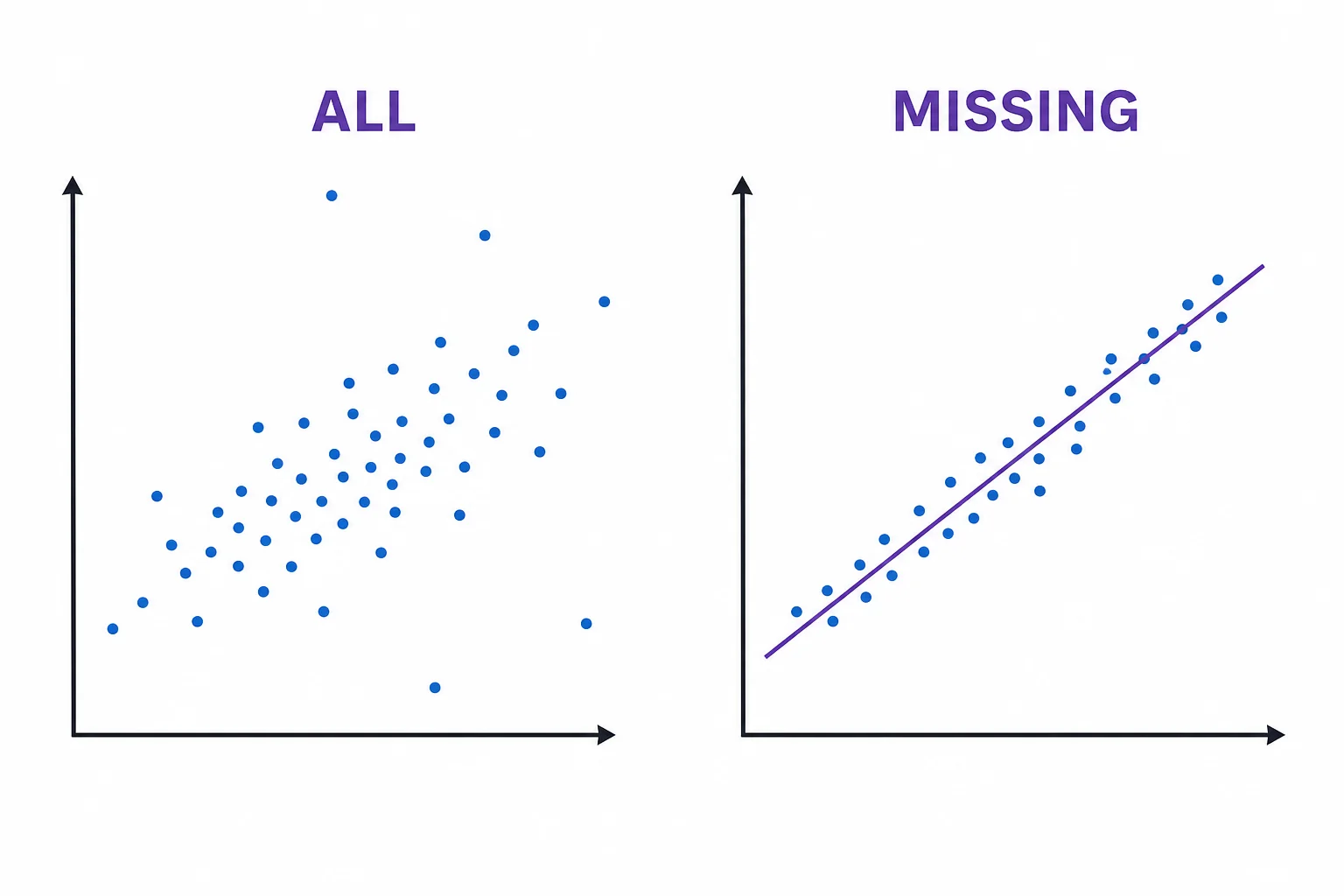
A pattern built from selected points is not the same as the full data.
Percent change needs a base
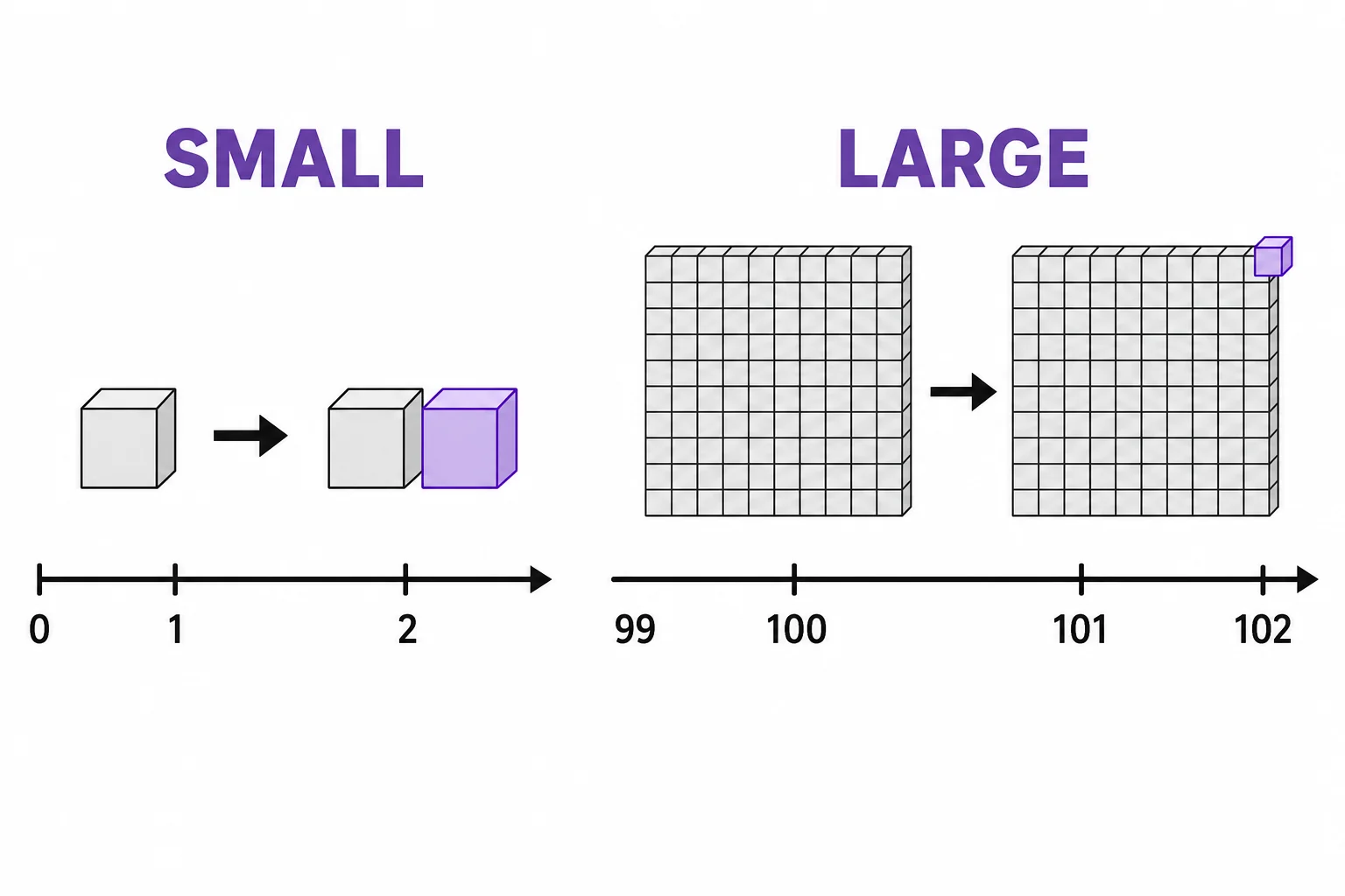
Percent change is hard to judge without knowing the starting value.
Vocabulary
- Axis
- A reference line on a graph that shows the scale and units for the data.
- Scale
- The set of values marked along an axis and the amount represented by each step.
- Truncated axis
- An axis that does not show the full range from zero or from the natural starting point.
- Cherry-picking
- Selecting only the data that support a claim while leaving out data that may change the conclusion.
- Outlier
- A data point that is far from the main pattern and may need extra investigation.
- Percent change
- A comparison of how much a value changes relative to its starting value.
In the Classroom
Redraw the same data
20 minutes | Grades 8-12
Give students one small data table and ask them to make two graphs that use different vertical scales. Students compare how the visual message changes, then write a fair caption for each graph.
Find the missing window
25 minutes | Grades 8-12
Show students a short time-range graph and the full time-range graph from the same data set. Students identify what claim the short graph supports and what the full graph adds or changes.
Data honesty checklist
30 minutes | Grades 9-12
Students review graphs from articles, ads, or class-created examples. They check axes, units, time range, missing data, and whether raw numbers or percents are being used.
Key Takeaways
- • A graph can use real numbers and still create a misleading impression.
- • Truncated axes can exaggerate differences, especially in bar graphs.
- • Changing the scale can make the same trend look steep or flat.
- • Cherry-picked ranges and missing points can hide the larger pattern.
- • Careful graph reading starts with axes, units, ranges, and the data source.