Practice interpreting graphs, identifying correlations, evaluating causal claims, and proposing stronger evidence for scientific conclusions.
Read each problem carefully. Use evidence from the graph description or data table to decide what claim is supported. Explain whether the evidence shows correlation, causation, both, or neither.
Evaluate evidence and avoid overclaiming from data
Science - Grade 9-12
- 1
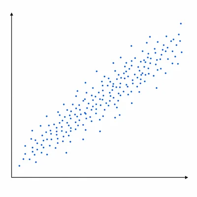
A scatter plot shows that students who sleep more hours per night tend to have higher biology test scores. A student claims, "Sleeping longer causes higher test scores." Is this claim fully supported by the graph? Explain.
- 2
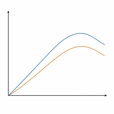
A graph shows that ice cream sales and number of swimmer rescues both increase during the summer months. Write a claim that is supported by the graph without confusing correlation with causation.
- 3
A researcher finds that neighborhoods with more trees have lower average summer air temperatures. Identify one possible causal explanation and one possible confounding variable.
- 4
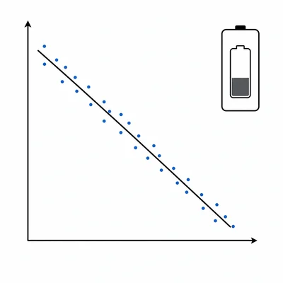
A graph shows a strong negative correlation between the number of hours a phone battery has been used and the percent of charge remaining. Is a causal claim reasonable here? Explain why or why not.
- 5
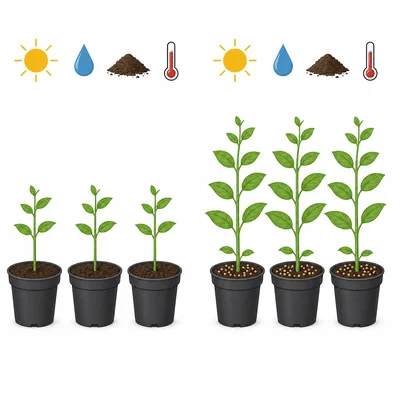
A study compares two groups of identical plants. One group receives fertilizer and the other does not. All plants receive the same light, water, soil type, and temperature. After four weeks, the fertilized plants are taller on average. What makes this evidence stronger for a causal claim than a simple scatter plot?
- 6
A graph shows that countries with higher average chocolate consumption also have more Nobel Prize winners. What is one reason it would be inappropriate to claim that eating chocolate causes Nobel Prizes?
- 7
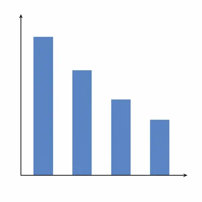
A data table from a school is shown: Students who exercise 0-1 days per week have an average stress score of 8.1. Students who exercise 2-3 days per week have an average stress score of 6.4. Students who exercise 4-5 days per week have an average stress score of 5.2. Students who exercise 6-7 days per week have an average stress score of 5.0. What type of relationship is shown, and what causal claim should be avoided?
- 8
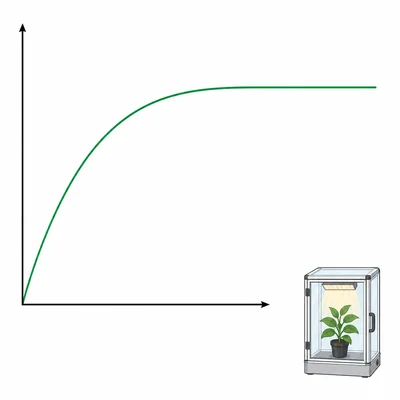
A graph shows that as carbon dioxide concentration increases in a sealed plant growth chamber, the rate of photosynthesis increases at first and then levels off. The experiment controls light intensity, temperature, and water. What causal claim is supported?
- 9
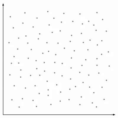
A scatter plot shows no clear pattern between shoe size and score on a chemistry exam. What conclusion is best supported by the graph?
- 10
A news headline says, "Energy drinks cause poor sleep in teenagers," based on a survey showing that teens who drink more energy drinks report fewer hours of sleep. Rewrite the headline so it is scientifically more accurate.
- 11
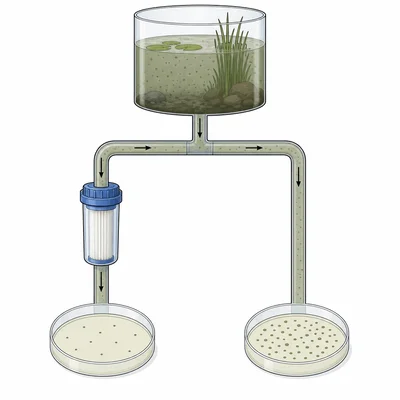
A scientist wants to test whether a new water filter causes a decrease in bacteria in pond water. Describe an experiment that could provide stronger evidence for causation.
- 12
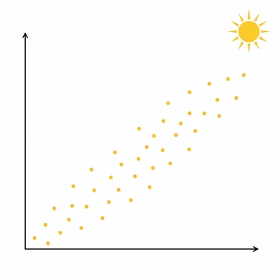
A graph shows that people who spend more time outdoors have higher vitamin D levels. Is it possible that time outdoors causes higher vitamin D? Is it proven by the graph alone? Explain both parts.
- 13
In a graph, city A has both high air pollution and high asthma emergency visits. City B has both low air pollution and low asthma emergency visits. What additional evidence would help determine whether air pollution contributes to asthma emergencies?
- 14
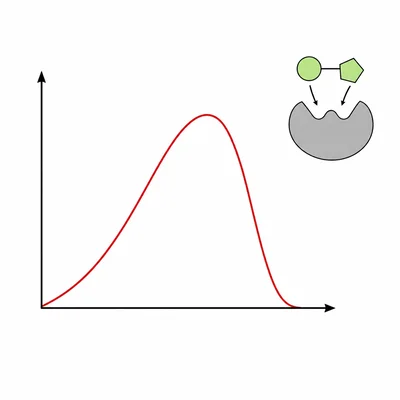
A controlled lab experiment shows that increasing water temperature from 10 degrees Celsius to 30 degrees Celsius increases the reaction rate of an enzyme, but temperatures above 50 degrees Celsius decrease the rate sharply. What conclusion is supported?
- 15
A student says, "Whenever two variables have a strong correlation, one must cause the other." Write a response that corrects this misconception.