Practice choosing the best chart type for different kinds of scientific data, including trends, comparisons, proportions, and relationships between variables.
Read each situation carefully. Choose the most appropriate chart type and explain why it fits the data. Show your reasoning in the space provided.
Selecting effective charts for experimental results
Science - Grade 9-12
- 1
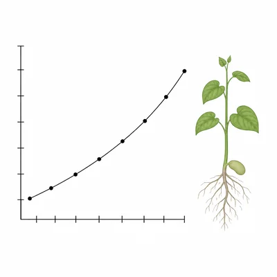
A biology student measures the height of a bean plant every two days for three weeks. Which chart type would best show how the plant's height changes over time? Explain your choice.
- 2
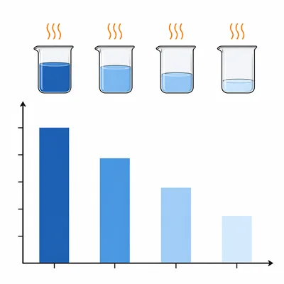
A chemistry class records the final temperature of four different liquids after each liquid is heated for the same amount of time. Which chart type would best compare the final temperatures? Explain your choice.
- 3
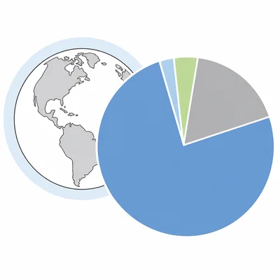
A student wants to show the percentage of gases in Earth's atmosphere, such as nitrogen, oxygen, argon, and carbon dioxide. Which chart type would best show the parts of the whole atmosphere? Explain your choice.
- 4
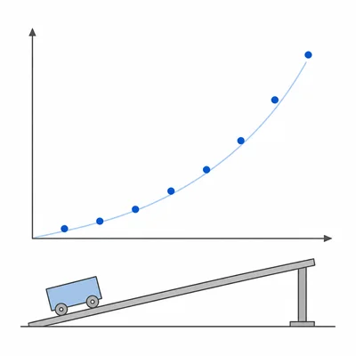
A physics student measures the distance traveled by a cart at different times as it rolls down a ramp. The student wants to analyze the relationship between time and distance. Which chart type should be used? Explain your choice.
- 5
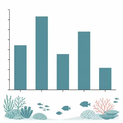
A marine scientist counts the number of fish species found at five different reef sites. Which chart type would best compare the species counts among the reef sites? Explain your choice.
- 6
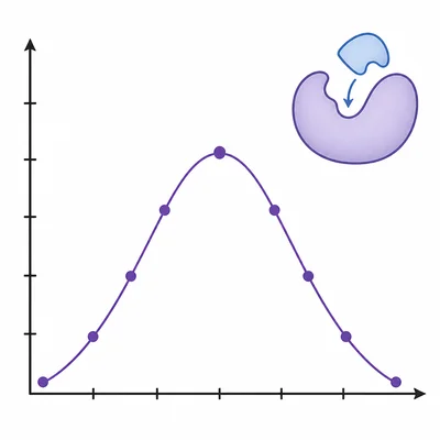
A student measures enzyme activity at different pH levels: 3, 5, 7, 9, and 11. Which chart type would best show how enzyme activity changes with pH? Explain your choice.
- 7
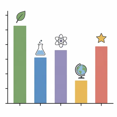
A survey asks 200 students to choose their favorite science subject: biology, chemistry, physics, environmental science, or astronomy. Which chart type would best display the number of students choosing each subject? Explain your choice.
- 8
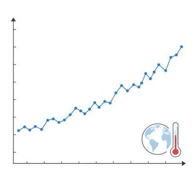
A climate scientist wants to show average global temperature from 1880 to the present. Which chart type should be used to show the long-term trend? Explain your choice.
- 9
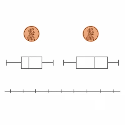
A student compares the masses of pennies made before 1982 and after 1982 using many measurements from each group. The student wants to show the distribution of masses in the two groups. Which chart type would be useful? Explain your choice.
- 10
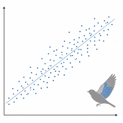
A researcher records the wing length and body mass of 50 birds to see whether larger birds tend to have longer wings. Which chart type is most appropriate? Explain your choice.
- 11
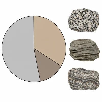
A geology class wants to display the relative percentages of rock types found in one sample: igneous, sedimentary, and metamorphic fragments. Which chart type should they use? Explain your choice.
- 12
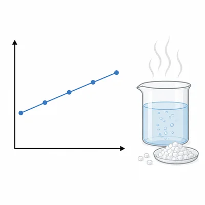
A student tests how the concentration of salt in water affects the boiling point. The student uses five salt concentrations and records the boiling point for each one. Which chart type would best show the relationship? Explain your choice.
- 13
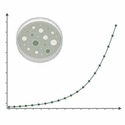
A lab group records the number of bacteria colonies in a petri dish every hour for 12 hours. Which chart type would best show the change in colony count over time? Explain your choice.
- 14
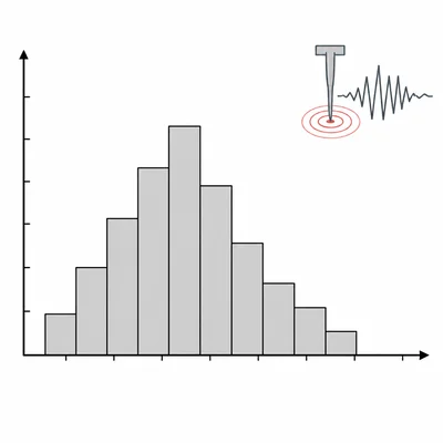
A student has data showing the number of earthquakes in each magnitude range: 2.0 to 2.9, 3.0 to 3.9, 4.0 to 4.9, and 5.0 to 5.9. Which chart type best shows the frequency of earthquakes in these numerical intervals? Explain your choice.
- 15
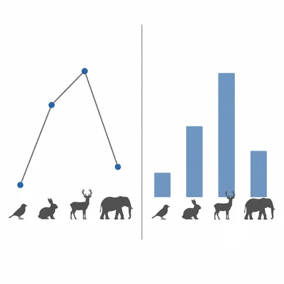
A student makes a graph with animal species on the x-axis and average heart rate on the y-axis, using connected points. The species are mouse, rabbit, dog, horse, and elephant. Explain why the connected line may be misleading and identify a better chart type.