Click image to open full size
How to Choose the Right Graph Type
Bar, line, pie, scatter, or histogram
Related Tools
Related Labs
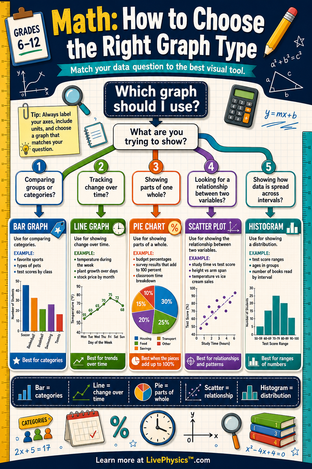
Graphs turn data into pictures that make patterns easier to see. Choosing the right graph type helps your audience understand comparisons, trends, parts of a whole, distributions, and relationships. A good graph choice can make a result clear in seconds, while a poor graph choice can hide the main idea. Students use graph choices in math, science, social studies, business, and everyday data reading.
A useful decision tree starts by asking what kind of data you have and what question you want to answer. Categories usually lead to bar graphs, change over time often leads to line graphs, and parts of one total can lead to pie charts. Two numerical variables often fit a scatter plot, while many values grouped into intervals fit a histogram. The graph should match the data structure, use clear labels, and make the pattern honest and easy to compare.
Key Facts
- Use a bar graph to compare amounts across categories.
- Use a line graph to show change over time or another ordered variable.
- Use a pie chart to show parts of one whole when the parts add to 100%.
- Use a scatter plot to study the relationship between two numerical variables.
- Use a histogram to show the distribution of numerical data grouped into intervals.
- Part percent = part / whole × 100%
Vocabulary
- Category
- A category is a group or label, such as favorite color, type of pet, or grade level.
- Trend
- A trend is a general pattern of increase, decrease, or stability in data.
- Distribution
- A distribution shows how often different values or ranges of values occur in a data set.
- Variable
- A variable is a quantity or characteristic that can change or take different values.
- Interval
- An interval is a range of numerical values used to group data, such as 0 to 9 or 10 to 19.
Common Mistakes to Avoid
- Using a pie chart for data that do not make one whole. A pie chart only works when all slices are parts of the same total and usually add to 100%.
- Using a line graph for unrelated categories. Lines suggest continuous change or order, so separate categories are usually better shown with bars.
- Using a bar graph when a histogram is needed. A bar graph compares categories, while a histogram shows how numerical values are distributed across intervals.
- Forgetting labels, units, or a clear title. Without these, readers may not know what the axes, amounts, or graph message mean.
Practice Questions
- 1 A class surveys 60 students about favorite school lunch: pizza 18, tacos 12, salad 8, sandwiches 14, pasta 8. Which graph type should be used to compare the categories, and what percentage chose pizza?
- 2 A weather station records the temperature at noon for 7 days: 68, 70, 72, 75, 73, 71, 69 degrees Fahrenheit. Which graph type best shows how temperature changed across the week?
- 3 A student wants to know whether hours studied and test score are related for 25 students. Which graph type should they choose, and what pattern would suggest a positive relationship?