Statistics: Misleading Statistics and Graphs
Spotting bias, distorted scales, and unfair comparisons
Spotting bias, distorted scales, and unfair comparisons
Statistics - Grade 6-8
- 1
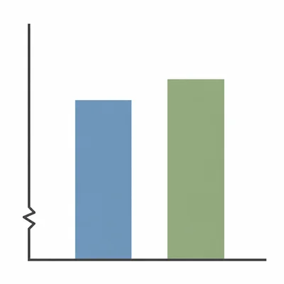
A bar graph compares two test scores: Class A scored 84 and Class B scored 88. The y-axis starts at 80 instead of 0, making Class B's bar look much taller. Explain why this graph is misleading.
- 2
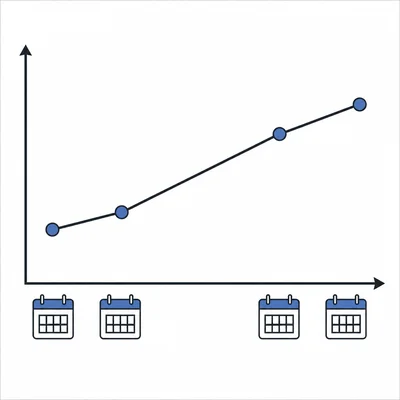
A line graph shows the price of a school lunch over four years: $2.50, $2.75, $3.00, and $3.25. The graph uses equal spacing on the x-axis, but the years shown are 2019, 2020, 2023, and 2024. What is misleading about this graph?
- 3

A survey says, "80% of students love the new cafeteria menu." The survey was taken from only 10 students sitting near the pizza line. Explain why this statistic may be unreliable.
- 4
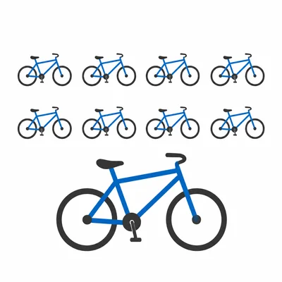
A pictograph shows bike sales. One bike picture represents 10 bikes, but in the final row the store uses a bike picture twice as tall and twice as wide to show 20 bikes. Why can this be misleading?
- 5
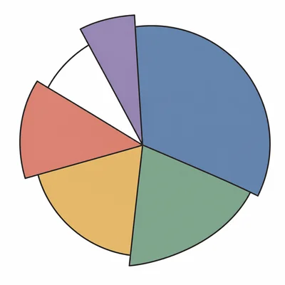
A pie chart shows favorite sports: soccer 40%, basketball 35%, baseball 30%, and swimming 20%. Explain the problem with this graph.
- 6
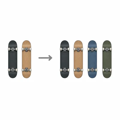
A store ad says, "Sales doubled this week." Last week the store sold 2 skateboards, and this week it sold 4 skateboards. Explain how the claim could be technically true but still misleading.
- 7
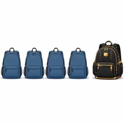
The mean price of five backpacks is $28. The prices are $20, $22, $24, $26, and $48. Why might the mean be misleading for describing a typical backpack price?
- 8
A company claims its cereal is "the top choice of families" because 52 out of 100 families in its survey chose it over one other cereal. What important information is missing?
- 9

A graph compares library visits in May and June. May had 400 visits and June had 500 visits. The title says, "Library Visits Explode by 100%!" Explain why the title is misleading.
- 10
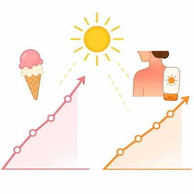
A line graph shows ice cream sales and sunburn cases both rising during the summer. A student says, "Ice cream causes sunburns." Explain the mistake in this conclusion.
- 11
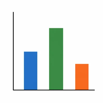
A bar graph compares the number of books read by three classes, but the y-axis has no numbers or scale. Why is the graph hard to trust?
- 12
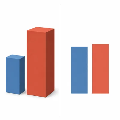
A 3D bar graph shows two sales numbers: Store A sold 90 items and Store B sold 100 items. The 3D effect makes Store B's bar look much larger because it appears wider and deeper. Explain why a simple 2D bar graph would be better.
- 13

A school reports, "Most students improved in math." The report only includes students who attended after-school tutoring and leaves out all other students. Why might this be misleading?
- 14
A website says, "9 out of 10 dentists recommend this toothpaste." It does not say how many dentists were asked or how they were selected. What should you question about this statistic?
- 15
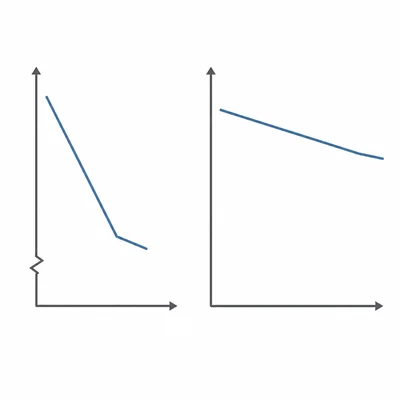
A graph shows a phone battery dropping from 100% to 95% in one hour, but the y-axis only shows 94% to 100%. The line looks very steep. Explain how to make the graph less misleading.
Related Tools
Related Labs
Related Infographics
Related Cheat Sheets
More Statistics Worksheets
Statistics: Chi-Square Tests
Grade 9-12 · 12 problems
Statistics: Confidence Intervals and Margin of Error
Grade 9-12 · 12 problems
Statistics: Frequency Tables and Histograms
Grade 6-8 · 12 problems
Statistics: Hypothesis Testing: Null and Alternate
Grade 9-12 · 12 problems
More Grade 6-8 Worksheets
Ratios & Proportions
Math · 8 problems
Forces & Motion
Physics · 8 problems
Figurative Language
Language Arts · 8 problems
US Government & Civics
Social Studies · 8 problems