Click image to open full size
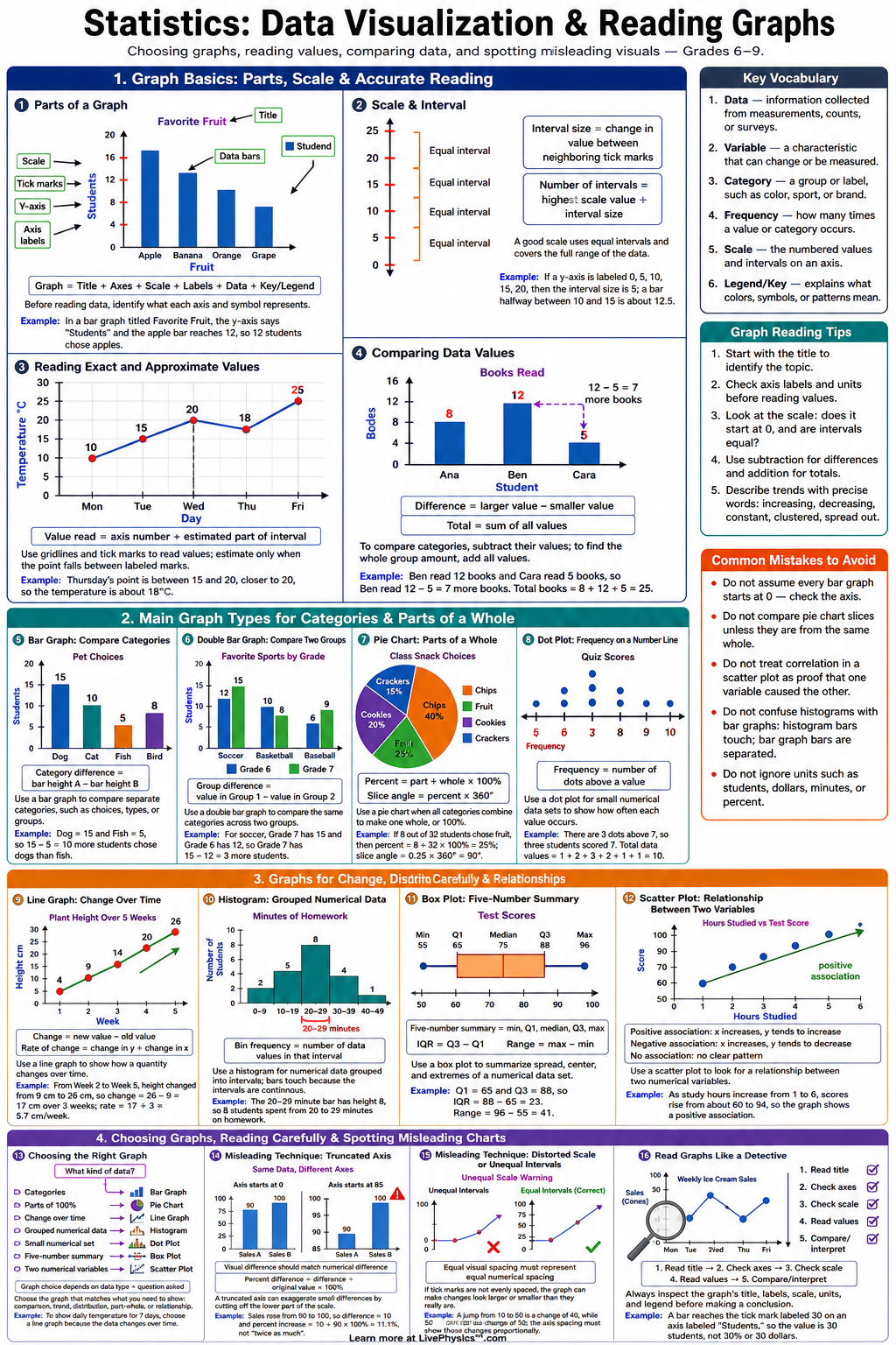
Data Visualization & Reading Graphs Cheat Sheet
A printable reference covering bar graphs, line graphs, histograms, scatter plots, circle graphs, scales, trends, and misleading graphs for grades 6-9.
Related Tools
Related Labs
Related Worksheets
Data visualization helps students turn numbers into pictures that are easier to compare, summarize, and explain. This cheat sheet covers how to read and create common statistical graphs, including bar graphs, line graphs, histograms, scatter plots, and circle graphs. Students need these skills to interpret data in math, science, social studies, and everyday media. Clear graph reading also helps students avoid being misled by confusing scales or incomplete labels. The most important ideas are choosing the right graph type, reading axes carefully, and understanding what each point, bar, sector, or bin represents. Students should check the title, labels, units, scale, key, and source before drawing conclusions. Useful calculations include frequency, relative frequency, percent, angle measures for circle graphs, and rates of change on line graphs. Good graphs make comparisons fair by using consistent scales and accurate spacing.
Key Facts
- A bar graph compares categories, and the height or length of each bar represents the frequency or value for that category.
- A line graph shows change over time, and the change between two points can be described by .
- The rate of change between two points on a line graph is .
- A histogram groups numerical data into intervals, and each bar represents the frequency in one interval.
- Relative frequency is calculated with .
- A circle graph sector angle is calculated with .
- A percent for a data category is calculated with .
- A misleading graph may use a broken scale, unequal intervals, missing labels, or a vertical axis that does not start at when comparing bar heights.
Vocabulary
- Scale
- The scale is the set of evenly spaced values shown on an axis of a graph.
- Interval
- An interval is a range of values used to group data, especially in a histogram.
- Frequency
- Frequency is the number of times a value, category, or interval appears in a data set.
- Relative Frequency
- Relative frequency is the fraction or percent of the total data that belongs to one category or interval.
- Outlier
- An outlier is a data value that is much higher or lower than most of the other values.
- Scatter Plot
- A scatter plot is a graph of ordered pairs that shows the relationship between two numerical variables.
Common Mistakes to Avoid
- Ignoring the axis scale is wrong because graph intervals may increase by , , , or another amount, which changes how values are read.
- Comparing bar heights without checking whether the vertical axis starts at is wrong because a shortened axis can exaggerate differences.
- Treating a histogram like a bar graph of categories is wrong because histogram bars represent numerical intervals, not separate labels.
- Connecting points on a scatter plot is wrong unless the data represent a continuous pattern where connecting points makes sense.
- Using the wrong graph type is wrong because categorical comparisons usually need a bar graph, changes over time usually need a line graph, and numerical intervals usually need a histogram.
Practice Questions
- 1 A line graph shows a plant height of on day and on day . What is the rate of change in centimeters per day?
- 2 In a class of students, chose soccer as their favorite sport. What percent of the class chose soccer, using ?
- 3 A circle graph shows that out of survey responses chose option A. What angle should represent option A, using ?
- 4 A news graph compares two prices using a vertical axis that starts at instead of . Explain why this graph might be misleading.