Click image to open full size
Percentiles and Quartiles
Ranking Data and Interpreting Test Scores
Related Tools
Related Worksheets
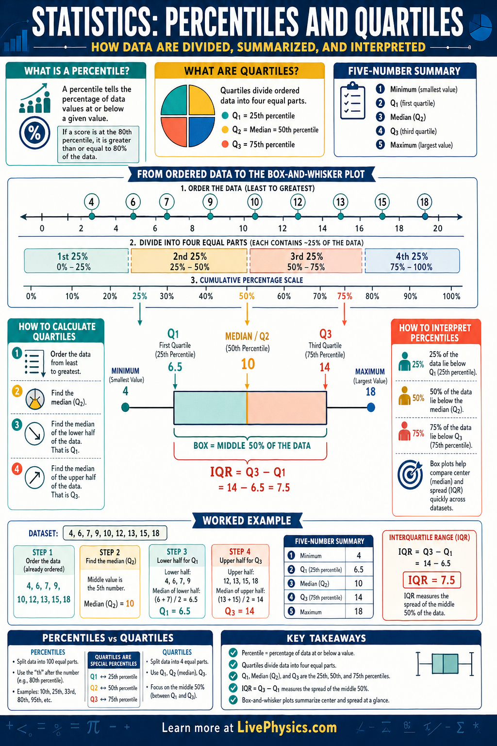
Percentiles and quartiles are tools for describing where a value falls within a set of ordered data. They help summarize large data sets in a way that is easier to interpret than listing every number. Teachers use them for test scores, doctors use them for growth charts, and scientists use them to compare measurements across groups. They matter because they show relative standing, spread, and the center of a distribution.
A percentile tells the percentage of data values at or below a given position, while quartiles divide ordered data into four equal parts. The first quartile is the 25th percentile, the median is the 50th percentile, and the third quartile is the 75th percentile. These values are often displayed in a box-and-whisker plot, where the box shows the middle half of the data and the whiskers extend to the lower and upper ends. From these summaries, students can quickly estimate spread using the interquartile range and spot possible outliers.
Key Facts
- Percentile of a value describes the percent of data at or below that value in an ordered data set.
- , , .
- Interquartile range: .
- A box plot uses the five-number summary: minimum, , median, , maximum.
- Lower fence = and upper fence = . Values beyond these may be outliers.
- To find quartiles, first order the data from least to greatest, then locate the median and the medians of the lower and upper halves.
Vocabulary
- Percentile
- A percentile is a measure that tells the percentage of data values at or below a given value.
- Quartile
- A quartile is one of the values that divides ordered data into four equal parts.
- Median
- The median is the middle value of an ordered data set, or the average of the two middle values if there are an even number of data points.
- Interquartile Range
- The interquartile range is the distance between and and measures the spread of the middle 50 percent of the data.
- Box-and-Whisker Plot
- A box-and-whisker plot is a graph that shows the five-number summary of a data set.
Common Mistakes to Avoid
- Not ordering the data first, which gives incorrect quartiles and percentiles because these measures depend on position in the sorted list.
- Confusing percent with percentile, which is wrong because a percent is part of 100 while a percentile is a rank or location within a data set.
- Using the mean instead of the median for , which is wrong because the second quartile is defined as the median of the ordered data.
- Assuming the whiskers always end at outliers, which is wrong because in a standard box plot the whiskers usually extend to the smallest and largest non-outlier values.
Practice Questions
- 1 Find the five-number summary and the interquartile range for the ordered data set 3, 5, 7, 8, 9, 12, 13, 15, 18.
- 2 A student scored higher than 18 out of 25 classmates on a quiz. What percentile is the student approximately in?
- 3 Two classes have the same median test score, but Class A has a much larger interquartile range than Class B. What does this tell you about the score distributions?