Migration Push-Pull Map Lab
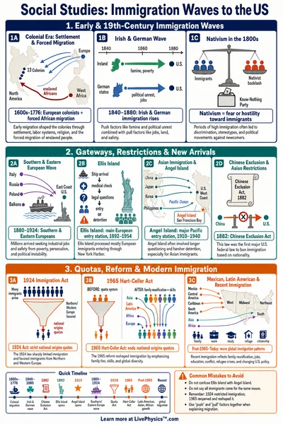
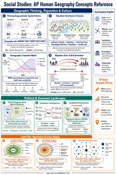
People leave a home region because of push factors and move toward destinations that pull them, held back by barriers such as distance, cost, and border policy. Adjust the sliders and watch the migrant flow split between two competing destinations on the map.
Guided ExperimentWhat makes people leave the origin?
The four push sliders stand for reasons to leave the origin. Predict what happens to the total number of migrants as you raise the push factors, and whether any single factor matters more than the others.
Write your hypothesis in the Lab Report panel, then click Next.
Migration Flow Map
The orange circle is the origin region and its number is the people who stay. Each arrow flows to a destination, and its width grows with the number of migrants. The greener destination circle takes the larger share of the flow.
Controls
Low wages and few jobs make it hard to earn a living at the origin.
Drought, floods, or poor harvests strain the land people depend on.
Instability or a lack of safety pushes people to seek somewhere calmer.
Few jobs, schools, or paths to advance limit what people can build at home.
1,000,000 people live at the origin.
A nearby region with steady farm and trade work and an open border.
A distant city with many jobs and services but a higher cost to reach.
Results
The average of the four push sliders. A higher push index means more people consider leaving the origin.
53% of the migrant flow
47% of the migrant flow
Data Table
(0 rows)| # | Scenario | Push index | Greenvale inflow | Capital City inflow | Total migrants | Stayers |
|---|
Reference Guide
Push Factors at the Origin
Push factors are the reasons people consider leaving a home region. In this model they are economic hardship, environmental stress such as drought or floods, conflict and safety, and a lack of opportunity in jobs and schooling.
The push index is the average of these four sliders. A higher push index means a larger share of the origin population looks for somewhere better to live, so the total number of people leaving rises with it.
Pull Factors and Barriers
Each destination has a pull, which combines jobs, safety, and services into one slider, and a barrier, which combines distance, cost, and border policy. The net draw of a destination is its attractiveness, the pull held back by the barrier.
A destination with a strong pull can still lose migrants if its barrier is high. A long distance, a heavy travel cost, or a strict border policy can cancel out a strong pull and redirect the flow toward a closer, easier destination.
How the Flow Splits
When two destinations both draw migrants, the flow divides between them in proportion to attractiveness. The flow to a destination equals the total migrants times its attractiveness divided by the sum of the attractiveness values.
The more attractive destination takes the larger share. When the two are equally attractive the flow splits evenly, and when one becomes much harder to reach its share shrinks and the other destination gains.
How to Read the Lab
The map shows the origin region on the left and two destinations on the right. Each arrow flows to a destination, and its width grows with the number of migrants. The origin circle shows the people who stay.
The results panel lists the push index, each destination's pull, barrier, and attractiveness, the inflow to each, and the total out-migration. Use the scenario presets to compare a drought, a distant destination, and two destinations that compete.