Statistics: Scatter Plots and Correlation
Interpreting patterns, direction, strength, and linear association
Interpreting patterns, direction, strength, and linear association
Statistics - Grade 9-12
- 1
A scatter plot compares hours studied for a test and test score. The points generally rise from left to right. Describe the direction of the association and explain what it means in context.
- 2
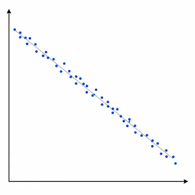
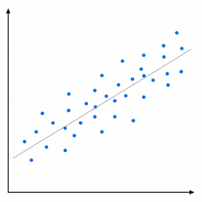
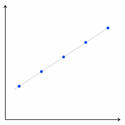
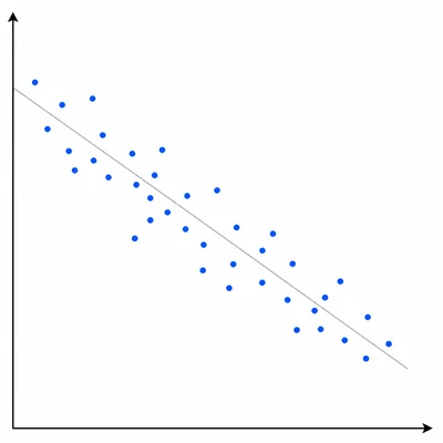
A scatter plot compares the age of a used car and its selling price. The points generally fall from left to right and are fairly close to a straight line. Describe the direction and strength of the association.
- 3
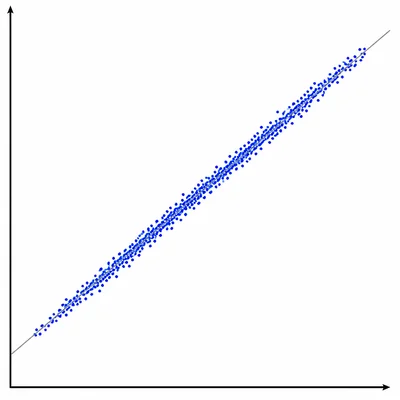
A data set has correlation coefficient r = 0.92. Describe the strength and direction of the linear relationship.
- 4
A data set has correlation coefficient r = -0.18. Describe the strength and direction of the linear relationship.
- 5
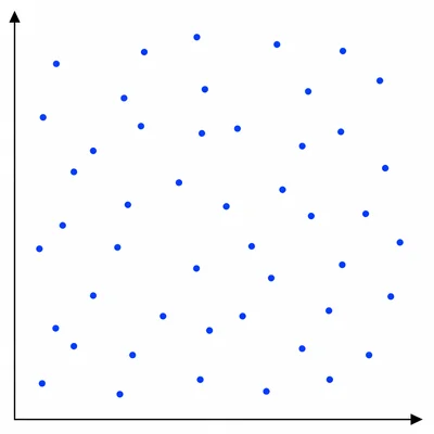
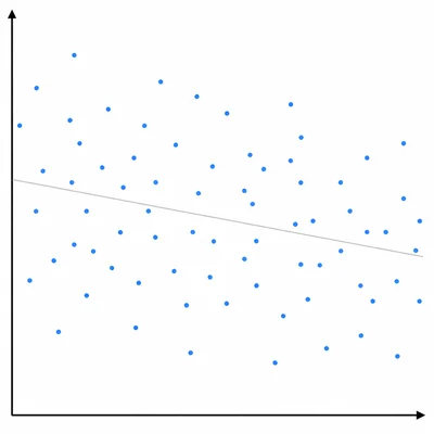
A scatter plot compares shoe size and math test score for students in a class. The points are spread randomly with no clear upward or downward pattern. What type of association is shown?
- 6
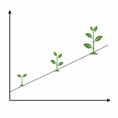
A line of best fit for predicting a plant's height in centimeters from days after planting is y = 2.4x + 5. What does the slope mean in context?
- 7
A line of best fit for predicting monthly electricity cost y from kilowatt-hours used x is y = 0.14x + 18. Predict the cost for a month when 650 kilowatt-hours are used.
- 8
A line of best fit is y = -3x + 75, where x is the number of hours after noon and y is the temperature in degrees Fahrenheit. Predict the temperature 6 hours after noon.
- 9
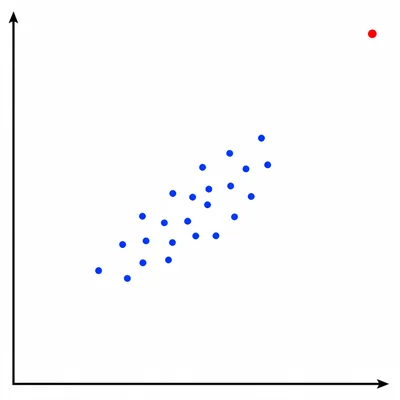
A scatter plot of height and arm span for students has one point far away from the rest of the data. What is this point called, and why might it matter?
- 10
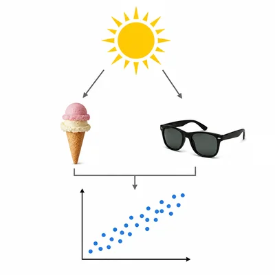
A scatter plot shows a strong positive association between the number of ice cream cones sold and the number of people wearing sunglasses at a beach. Can you conclude that buying ice cream causes people to wear sunglasses? Explain.
- 11
A teacher records the following pairs for hours of practice and free throw percentage: (1, 42), (2, 48), (3, 55), (4, 61), (5, 65). Describe the association in the data.
- 12
A scatter plot comparing daily screen time and hours of sleep has a negative association. If a student has more daily screen time than another student, what would the trend predict about their hours of sleep?
Related Tools
Related Labs
Related Infographics
Related Cheat Sheets
More Statistics Worksheets
Statistics: Chi-Square Tests
Grade 9-12 · 12 problems
Statistics: Confidence Intervals and Margin of Error
Grade 9-12 · 12 problems
Statistics: Frequency Tables and Histograms
Grade 6-8 · 12 problems
Statistics: Hypothesis Testing: Null and Alternate
Grade 9-12 · 12 problems
More Grade 9-12 Worksheets
Linear Equations
Math · 8 problems
Cell Biology
Biology · 8 problems
Reading Comprehension
Language Arts · 8 problems
Historical Thinking & Evidence
Social Studies · 8 problems