Click image to open full size
Frequency Tables & Histograms Cheat Sheet
A printable reference covering frequency tables, relative frequency, cumulative frequency, class intervals, and histogram interpretation for grades 6-9.
Related Tools
Related Labs
Related Worksheets
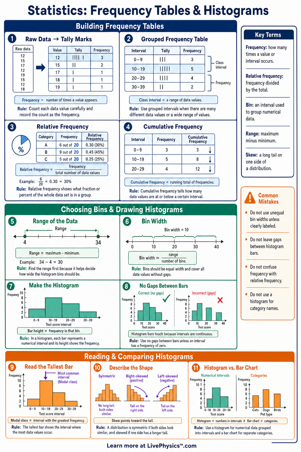
Frequency tables and histograms help students organize data so patterns are easier to see. This cheat sheet covers how to count data values, group them into intervals, and display the results clearly. Students need these tools to summarize large data sets, compare groups, and prepare for statistics topics like distributions and measures of center. It is designed as a quick reference for classwork, homework, and test review. The most important ideas are frequency, relative frequency, cumulative frequency, and equal-width intervals. A frequency table lists how often each value or interval occurs, while a histogram uses touching bars to show frequencies for numerical intervals. Relative frequency is found with , and cumulative frequency keeps a running total. Good histograms use clear labels, equal bin widths, and bar heights that match the table.
Key Facts
- Frequency means the number of times a value or interval appears in a data set.
- The total number of data values is , where represents each frequency.
- Relative frequency is , and percent frequency is .
- Cumulative frequency is a running total, so each row adds the current frequency to all previous frequencies.
- A class interval groups numerical data, such as , so each data value belongs to exactly one interval.
- Histogram bars touch because the horizontal axis represents continuous numerical intervals, not separate categories.
- For a frequency table and histogram to match, each bar height must equal the frequency for its interval.
- The sum of all relative frequencies should be or , allowing for small rounding differences.
Vocabulary
- Frequency
- Frequency is the number of times a data value or data interval occurs.
- Frequency Table
- A frequency table is a chart that organizes data values or intervals with their counts.
- Relative Frequency
- Relative frequency is the part of the total represented by a category or interval, calculated as .
- Cumulative Frequency
- Cumulative frequency is the running total of frequencies up to and including a given row.
- Class Interval
- A class interval is a range of values used to group numerical data, such as .
- Histogram
- A histogram is a graph that uses touching bars to show the frequencies of numerical intervals.
Common Mistakes to Avoid
- Using overlapping intervals, such as to and to , is wrong because the value could fit in two places. Use intervals like and .
- Leaving gaps between histogram bars is wrong because histograms show numerical intervals along a continuous scale. Gaps are usually used for bar graphs with separate categories.
- Forgetting to add every frequency is wrong because the table total must match the number of data values, so check that .
- Mixing frequency and relative frequency is wrong because frequency is a count, while relative frequency is a fraction or percent such as .
- Choosing unequal interval widths without explaining them is misleading because bar heights become harder to compare. For grades 6-9, use equal-width intervals unless your teacher says otherwise.
Practice Questions
- 1 The data set is . Create a frequency table for each value.
- 2 A class has test score intervals with frequencies: : , : , : , and : . Find the total number of students and the relative frequency for .
- 3 A histogram has intervals , , , and with bar heights , , , and . What is the cumulative frequency through ?
- 4 Explain why a histogram is better than a regular bar graph for showing the distribution of student heights.