Statistics: Displaying Data: Choosing the Right Graph
Select graphs that match the data and purpose
Select graphs that match the data and purpose
Statistics - Grade 6-8
- 1
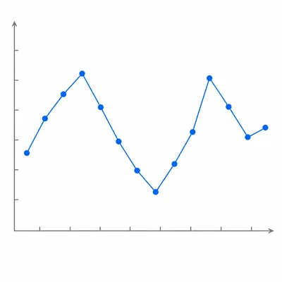
A student records the temperature outside at noon every day for 14 days. Which type of graph would best show how the temperature changed over time?
- 2
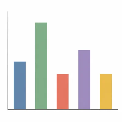
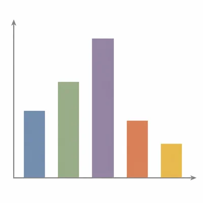
A class surveys students about their favorite school lunch: pizza, tacos, sandwiches, salad, or pasta. Which type of graph would best compare the number of votes for each lunch?
- 3
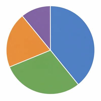
A store manager wants to show what percent of total monthly sales came from clothing, shoes, accessories, and sports gear. Which type of graph should the manager use?
- 4
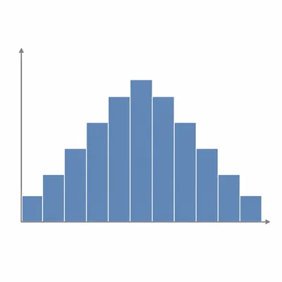
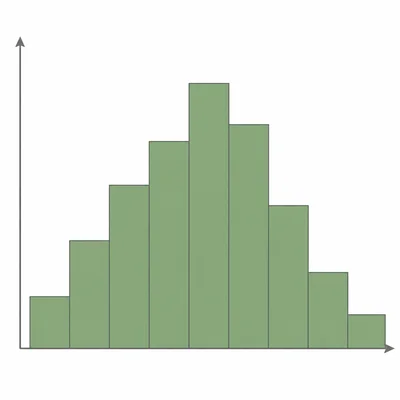
A teacher measures the heights of 30 students and groups the heights into intervals such as 50-54 inches, 55-59 inches, and 60-64 inches. Which type of graph would best display the distribution?
- 5
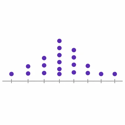
A student wants to show the exact number of books read by each student in a small reading group. The numbers are 2, 4, 4, 5, 6, 6, 6, 8, and 10. Which graph would work well and why?
- 6
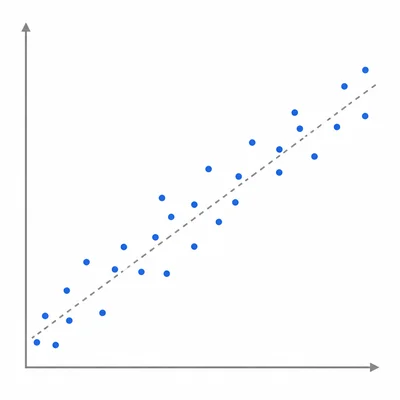
A coach records each athlete's practice time and race time to see whether more practice is related to faster race times. Which graph would best show the relationship between the two numerical variables?
- 7

A science club wants to compare the typical amount of rainfall in four cities and also show the spread of the rainfall data for each city. Which type of graph would be best?
- 8
A student collected data on the favorite color of 80 students. The categories are red, blue, green, purple, yellow, and orange. Should the student use a histogram or a bar graph? Explain.
- 9
A family tracks its electric bill each month for one year. The family wants to see the pattern from January through December. Which graph is best?
- 10
A newspaper reports the results of a survey about how students get to school: bus, car, bike, walk, or train. It wants readers to compare which option is most common. Which graph is best?
- 11
A student wants to display the ages of people at a community event. The data include many ages from 1 to 85, and the student wants to show how many people are in each age range. Which graph is best?
- 12
A class records the number of pets owned by each student. The data are 0, 1, 1, 2, 2, 2, 3, 4, and 5. The teacher wants students to see every data value. Which graph is a good choice?
- 13
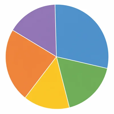
A researcher wants to show the percent of a city's land used for homes, parks, businesses, roads, and schools. Which graph is best, and what should the parts add up to?
- 14
A student creates a graph with shoe size on one axis and height on the other axis for each student in the class. What type of graph is this, and what can it help show?
- 15

A teacher has test scores from two classes and wants to compare the median, range, and overall spread of the scores. Which graph should the teacher choose?
Related Tools
Related Labs
Related Infographics
Related Cheat Sheets
More Statistics Worksheets
Statistics: Chi-Square Tests
Grade 9-12 · 12 problems
Statistics: Confidence Intervals and Margin of Error
Grade 9-12 · 12 problems
Statistics: Frequency Tables and Histograms
Grade 6-8 · 12 problems
Statistics: Hypothesis Testing: Null and Alternate
Grade 9-12 · 12 problems
More Grade 6-8 Worksheets
Ratios & Proportions
Math · 8 problems
Forces & Motion
Physics · 8 problems
Figurative Language
Language Arts · 8 problems
US Government & Civics
Social Studies · 8 problems