Click image to open full size
Categorical vs Quantitative Data Cheat Sheet
A printable reference covering categorical data, quantitative data, frequency tables, dot plots, histograms, bar graphs, and summary statistics for grades 6-10.
Related Tools
Related Labs
Related Worksheets
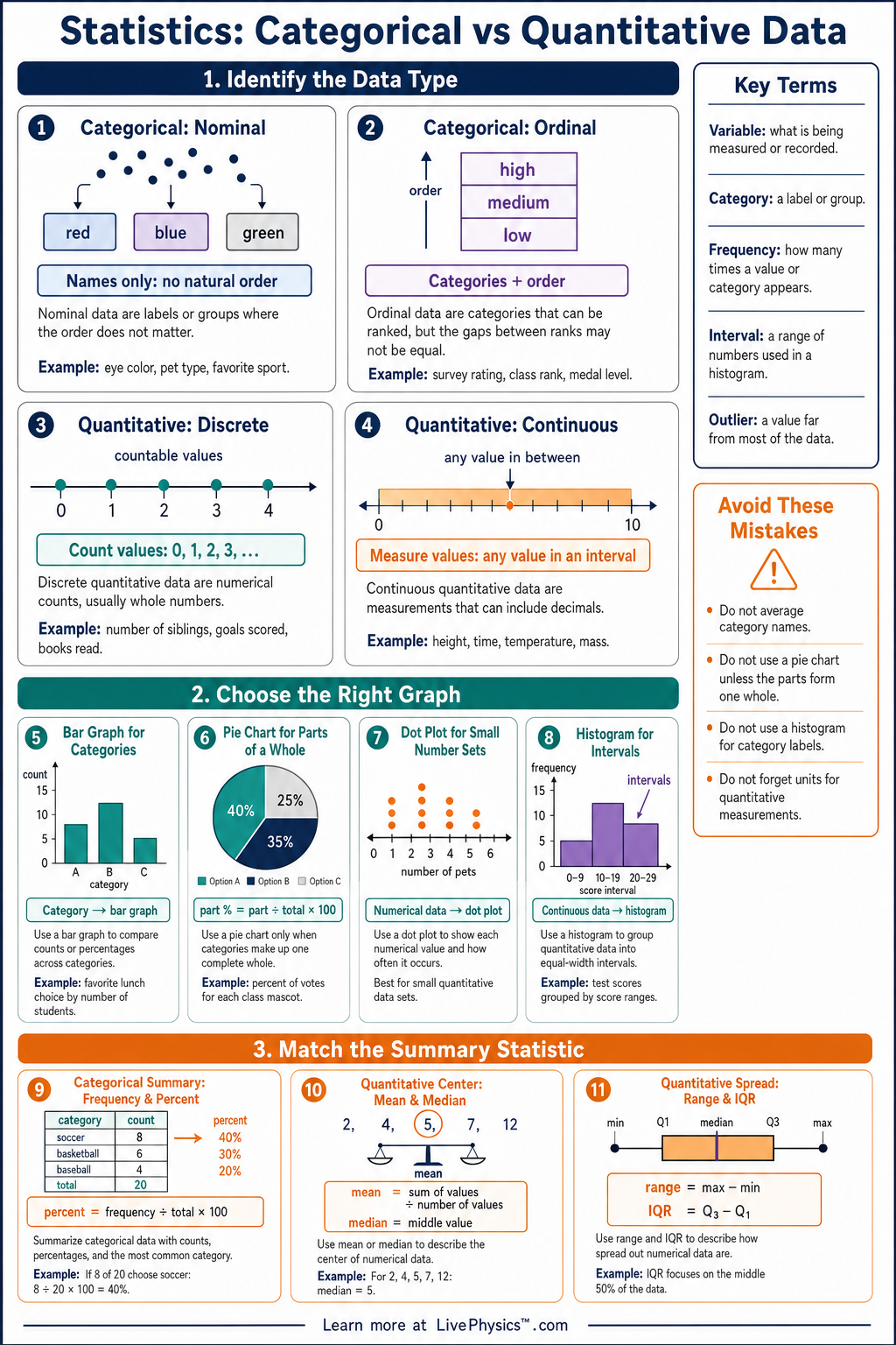
Statistics begins with knowing what kind of data you have. This cheat sheet helps students tell the difference between categorical data, which describe groups or labels, and quantitative data, which measure numbers. Choosing the correct data type matters because it determines which graph, table, and summary measure makes sense. Students can use this reference when organizing survey results, experiment data, or real-world measurements. Categorical data are usually summarized with counts, relative frequencies, bar graphs, or two-way tables. Quantitative data are summarized with measures of center such as mean and median, measures of spread such as range, and displays such as dot plots, histograms, and box plots. A helpful rule is that arithmetic only makes sense for quantitative data, so values like jersey numbers and ZIP codes are not quantitative measurements. Good statistical thinking starts by identifying the variable, classifying the data, and selecting an appropriate display.
Key Facts
- Categorical data place individuals into groups or labels, such as eye color, favorite sport, or type of pet.
- Quantitative data are numerical measurements or counts where arithmetic is meaningful, such as height, time, age, or number of siblings.
- A frequency is the count in a category, and the total sample size is .
- Relative frequency is found with .
- A percent frequency is found with .
- The mean of quantitative data is .
- The range of quantitative data is .
- Use bar graphs for categorical data and dot plots, histograms, or box plots for quantitative data.
Vocabulary
- Categorical Data
- Data that describe qualities, groups, names, or labels rather than measurements.
- Quantitative Data
- Data made of numbers that represent counts or measurements where arithmetic is meaningful.
- Variable
- A characteristic being recorded or measured for each individual in a data set.
- Frequency
- The number of times a value or category appears in a data set.
- Relative Frequency
- The fraction or proportion of the total data that belongs to a category.
- Distribution
- The pattern of values in a data set, including where values cluster and how they spread out.
Common Mistakes to Avoid
- Treating every number as quantitative is wrong because some numbers are labels, such as jersey numbers, room numbers, or ZIP codes.
- Using a histogram for categorical data is wrong because histograms show intervals of numerical values, not separate labels or groups.
- Finding the mean of categorical data is wrong because categories like colors or favorite foods cannot be added and divided meaningfully.
- Confusing frequency with relative frequency is wrong because frequency is a count, while relative frequency is a fraction such as .
- Forgetting to include units for quantitative data is wrong because measurements like could mean seconds, meters, or students.
Practice Questions
- 1 Classify each variable as categorical or quantitative: favorite ice cream flavor, number of books read in a month, shoe size, and type of phone.
- 2 A survey of students found that chose soccer as their favorite sport. Find the relative frequency and percent for soccer.
- 3 The data set gives the number of pets owned by different families. Find the mean and range.
- 4 A student says ZIP codes are quantitative because they are written with numbers. Explain why this reasoning is incorrect.