Data Storytelling & Dashboard Lab
Read a headline claim, study its small dashboard of mini charts, and decide whether the data actually backs up the claim. When it does not, name the deception technique behind it, a misleading axis, a biased sample, correlation mistaken for causation, or a cherry-picked stat, then reveal the answer and the explanation.
Guided Experiment Judge the Dashboard
Hypothesis
Setup
Run Experiment
Analyze
Conclude
Which headline do you predict is honestly supported by its dashboard, and why?
Write your hypothesis in the Lab Report panel, then click Next.
Controls
"New Study App Makes Test Scores Soar!"
Does the data support the headline?
0 / 500
0 / 500
0 / 500
Reference Guide
Is This Data Story Honest?
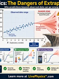
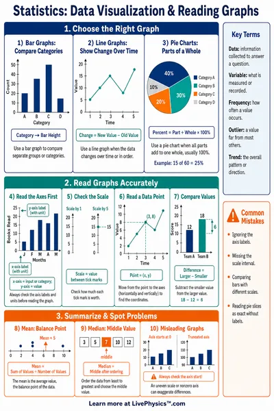
- Misleading axis. The y-axis is truncated or scaled so a small change looks huge.
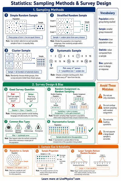
- Biased sample. The people or items measured are not representative of the whole group the claim is about.
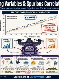
- Correlation, not causation. Two things rise and fall together, but one is not shown to cause the other.
- Cherry-picked stat. A narrow, favorable number is highlighted while the fuller picture tells a different story.
How to Use This Lab
- Pick a data story and a difficulty level.
- Read the headline and study every mini chart in the dashboard, including its caption.
- Decide whether the data supports the headline, and choose a technique if it does not.
- Reveal the answer, read the explanation, and record what you noticed in the lab report below.
Related Content
Related Tools
Descriptive Statistics Calculator
Compute mean, median, mode, standard deviation, and more. Visualize data with interactive box plots and histograms.
Box Plot Builder
Build side-by-side box plots for up to three datasets. Shows Q1, median, Q3, Tukey whiskers, and outlier detection.
Scatter Plot and Correlation Explorer
Plot x,y data pairs to visualize relationships. Computes Pearson correlation coefficient, r-squared, and fits a linear regression line.
Linear Regression Calculator
Find the best-fit line for paired data. See slope, intercept, correlation, R-squared, scatter plot, and residual analysis.
Related Labs
Scientific Data Graphing Lab
General purpose data analysis lab. Paste a CSV, upload a file, or load a sample. Choose X and Y columns and fit a linear, quadratic, cubic, power, exponential, or logarithmic curve. Auto best fit picker, R squared, residuals, and shareable URL.
Graphs for Kids Lab
Build bar graphs from category data, read which groups have the most and fewest, compute the difference, and record findings to practice data literacy skills.
Mean, Median & Mode Lab
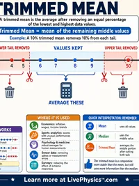
Enter number datasets, compute mean, median, mode, and range instantly, and record multiple datasets to discover when each measure of center best represents the data.
Hypothesis Testing Lab
Set up a one-sample z-test. Enter population mean, sample mean, standard deviation, and sample size. Compute the z-statistic, p-value, and decision to reject or fail to reject the null hypothesis.