Statistics
Reading a Bar Graph as if It Were a Histogram
Treating a bar graph and a histogram as the same kind of chart.
Quick check
Why students make it
Both use rectangular bars, so they look like the same display at a glance.
The rule done right
A bar graph compares separate categories and has gaps between bars. A histogram shows the distribution of one numeric variable over intervals and has no gaps, because the intervals are continuous.
Related resources
-
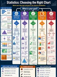 Statistics, Choosing the Right Chart Infographic
 -
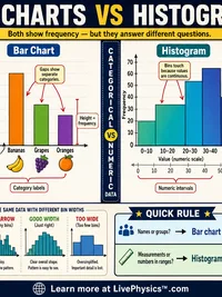 Statistics, Bar Charts vs Histograms Infographic
 -
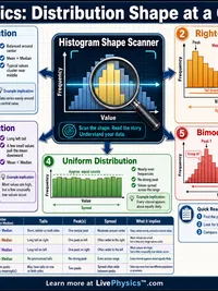 Statistics, Distribution Shape at a Glance Infographic
 -
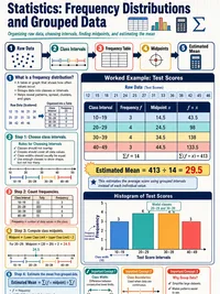 Statistics, Frequency Distributions and Grouped Data Infographic
 -
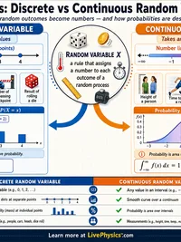 Statistics, Discrete vs Continuous Random Variables Infographic
 - Frequency Tables & Histograms Cheat Sheet
- Data Visualization & Reading Graphs Cheat Sheet
- Descriptive Statistics Cheat Sheet
- Which variable goes on which axis in a scientific graph (DRY MIX) Memory Aid Cheat Sheet
- Statistics, Displaying Data, Choosing the Right Graph Worksheet
- Statistics, Frequency Tables and Histograms Worksheet
- Statistics, Misleading Statistics and Graphs Worksheet
- Statistics, Descriptive Statistics Worksheet
- Statistics, Box-and-Whisker Plots Worksheet
- Picture Graphs, Bar Graphs & Line Plots Builder Tool
- Descriptive Statistics Calculator Tool
- Percentile Calculator Tool
- Box Plot Builder Tool
- Graphs for Kids Lab Lab
- Exploratory Data & Distribution Lab Lab
- Line Plot & Fraction Data Lab Lab
- Scientific Data Graphing Lab Lab